iOS/ANDROID APP CASE STUDY
Shop Similar Items
on Walmart's Mobile App
OVERVIEW
Walmart’s app is built to help shoppers discover the right product for their needs, even if it’s not the first one they see.
Walmart’s iOS and Android apps are built for speed and simplicity, helping customers quickly build their baskets and check out from anywhere. But data revealed a compelling opportunity: conversion rates increase sharply as customers view more items during a session. For example, customers who view just one item convert at 0.7%, two items convert at 2.3%, and those who view 3 to 5 items convert at 4.4%. That rate jumps to 7.6% for 6 to 10 items, and reaches 13.1% when 11 or more items are viewed. In short, the more products a customer sees, the more likely they are to buy. However, less than 30% of users scroll far enough on the item page to discover more items. This insight sparked a key question: how might we surface similar products higher on the page to capture that value earlier?
ROLE & DETAILS
Senior Product Designer
Competitive Research, Prototyping, Testing, Leadership Presentations, Documentation
Team
1 Product Designer
1 Product Owner
3 Engineers
Design Timeline
May 2023 – October 2024
Tools
Figma
THE CHALLENGE
"How might we surface similar, relevant items in a more prominent position on the page—enhancing discovery without disrupting the customer’s focus or derailing their intended journey?"
Our primary goal above the fold is to build customer confidence in the product. We use large, compelling images, authentic ratings and reviews, and clear branding to persuade shoppers to buy. Since customers have already tapped on the item, we know there’s intent—but a key question remains: does this product truly meet their needs? Within this valuable space, how can we introduce similar product options that encourage exploration without distracting or disrupting their journey? By striking this balance, we aim to reduce bounce and exit rates while keeping customers engaged and shopping confidently with Walmart.
Target
H&M
Amazon
Nordstrom
Shein
Best Buy
Fashion Nova
Temu
Wayfair
Ulta
Zara
Lowe's
COMPETITIVE RESEARCH
I conducted a comprehensive review of a broad range of competitors.
During my research, I was surprised to discover that none of the major competitors—Target, Amazon, Shein, Best Buy, Wayfair, or Lowe’s—were addressing this challenge by showcasing alternative product options above the fold. At first, I hesitated. Guiding a customer away from a product they had intentionally selected seemed counterintuitive, even risky, as it might disrupt their decision-making flow. However, when I analyzed the unusually high bounce and exit rates, it became clear there was a valuable opportunity to help customers find a better product fit and keep them engaged within Walmart’s shopping journey. Testing a feature to improve product discovery was not only logical but strategically essential.
FIRST ITERATION
We first tested a minimal design to validate customer interest before committing to further development.
Embracing rapid testing and iteration, we began with a small scale launch, adding a lightweight module to the item page to quickly gauge customer response. Working within a tight timeline and limited engineering capacity, we kept the initial design simple to enable fast implementation. Testing revealed strong engagement, with impressions high and click-through-rates even higher. However, the module displaced other key content on the page, causing declines in ad revenue. As a result, we paused the full rollout and shifted focus to refining the experience further, prioritizing Walmart’s revenue impact before scaling.
SECOND ITERATION
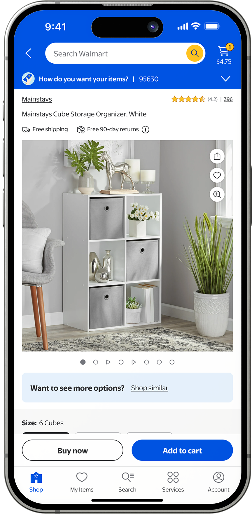
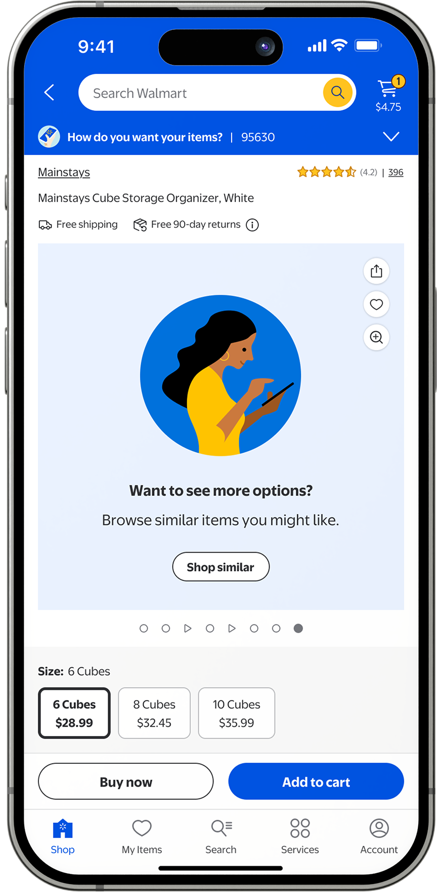
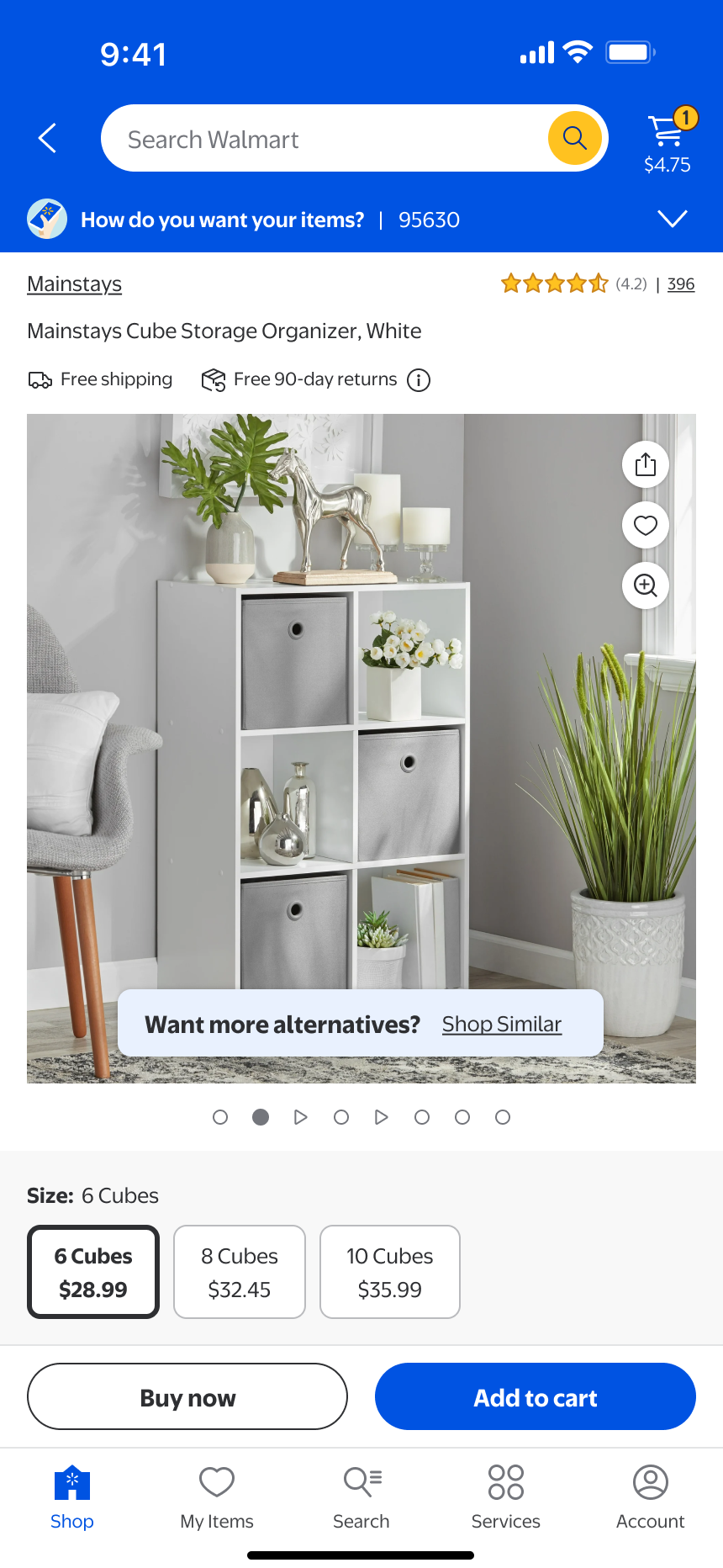
We turned our attention to the image carousel to explore whether this was the moment customers were making their purchase decisions.
For our next iteration, we focused on the image carousel, one of the most engaging elements on the item page. Since images play a crucial role in helping customers decide if a product meets their needs, enhancing this experience felt like a natural step. To avoid interrupting the user’s discovery journey, we tested placing a “Shop Similar” prompt at the end of the carousel, assuming that after viewing all the images, customers might be ready to decide if the item is the right fit. However, we ultimately chose not to launch this feature, as data showed that of the 50% of customers who swipe to the end of the carousel, only 3.8% clicked on the "Shop similar" CTA and of that, only 0.009% added a new item to their cart. The feature didn't meet the critera to launch.
CONTINUED DESIGN EXPLORATIONS
Confident that the item image carousel was the right area to explore, I continued testing alternative CTA placements.
I continued exploring design options centered on the image carousel. My goal was to gently highlight similar items without pulling attention away from the main product experience. At the same time, I looked for ways to simplify and streamline some of the existing on-image buttons, an improvement Walmart has been considering for the past two years.
Floating Above Image
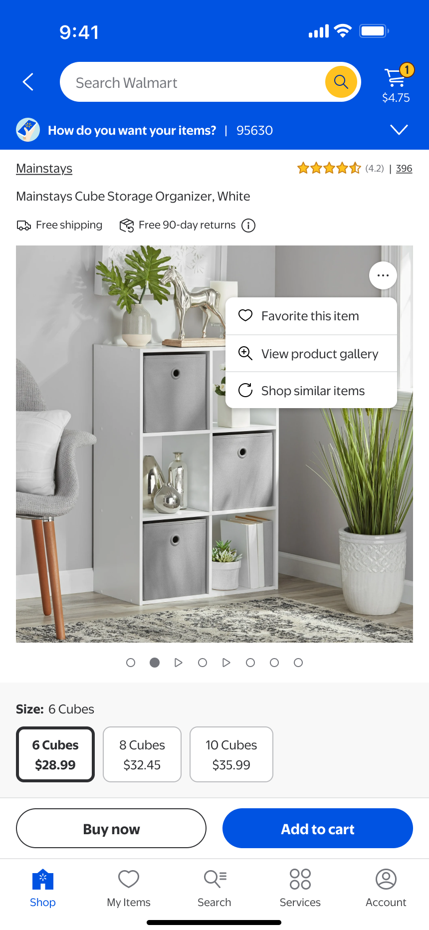
Consolidated Overflow
Text-Based Gradient
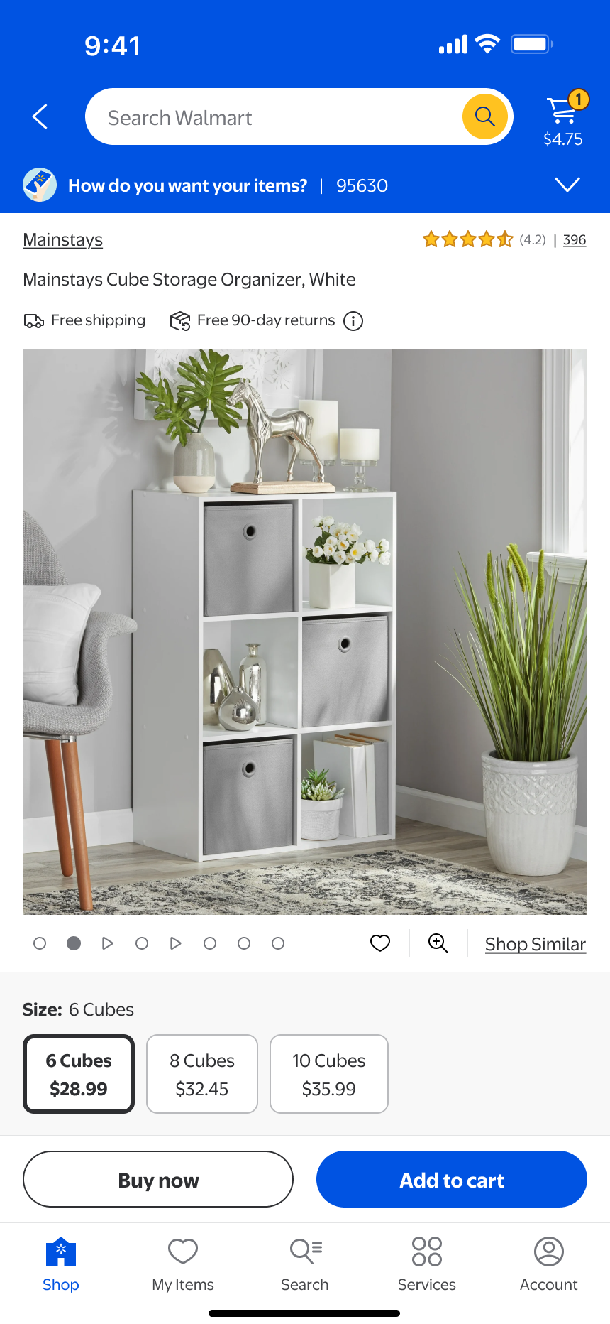
In-Line w/ Pagination
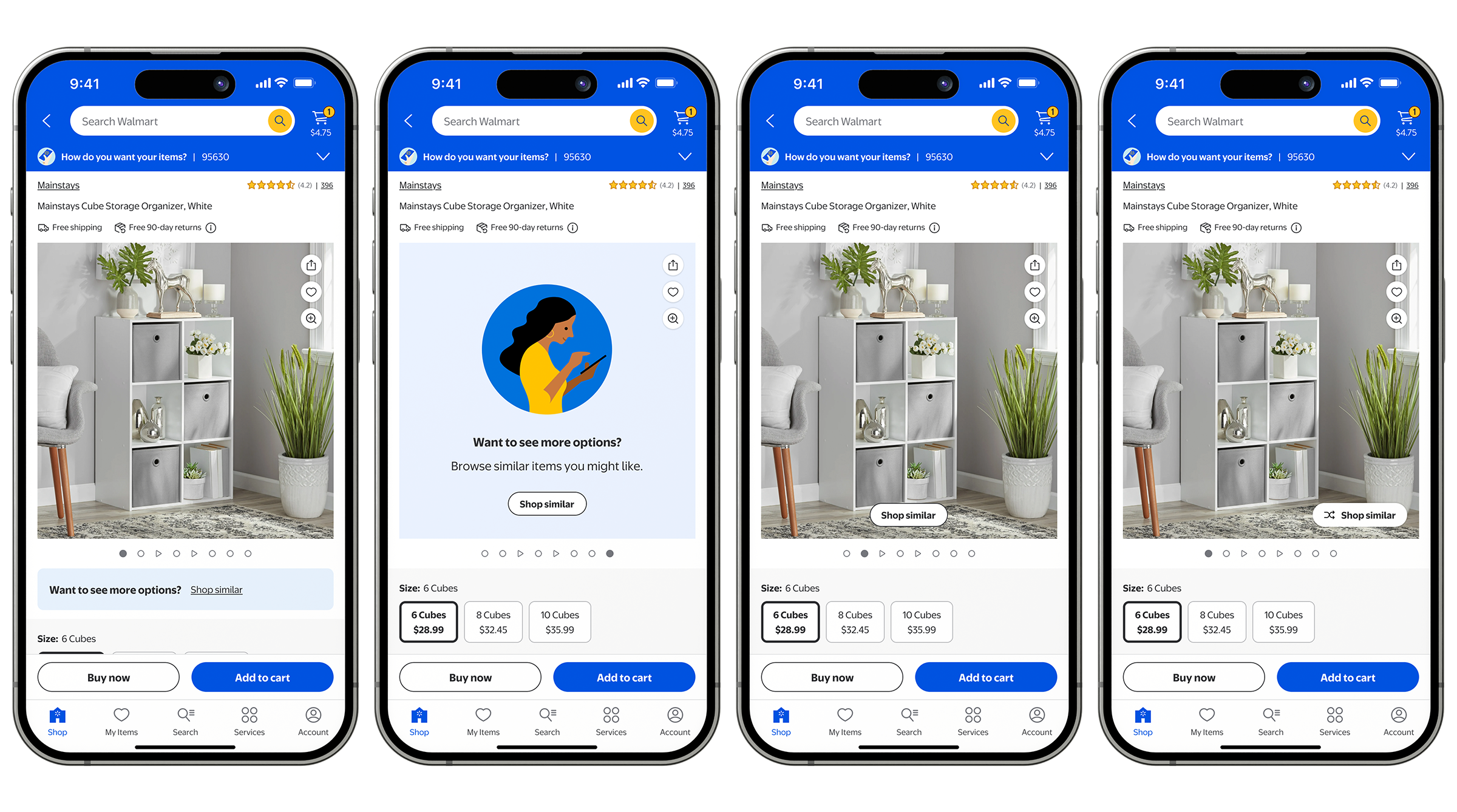
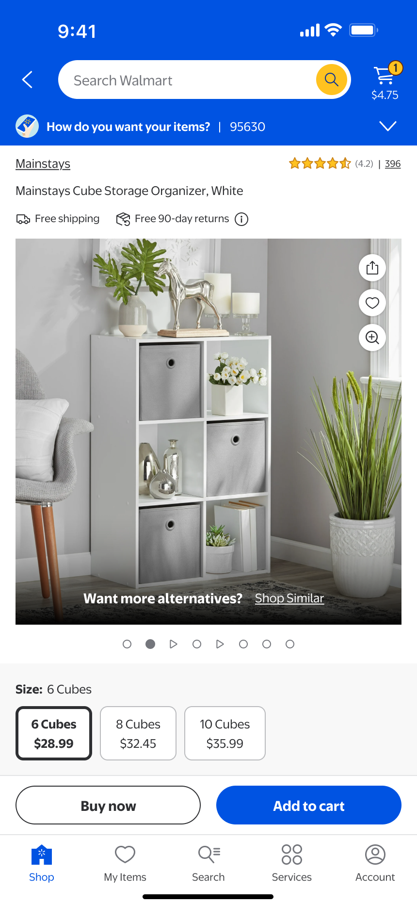
THIRD ITERATION
I wanted to test a version that surfaced earlier in the experience.
For my third iteration, I continued refining the image carousel with a lighter, earlier prompt approach. My goal was consistent: avoid interrupting the customer’s discovery journey while gently offering an alternative option if the current product didn’t feel like the right fit. This time, I designed a subtle call to action that gradually appeared at the bottom of the carousel as the user swiped from the first image to the second. This approach allowed customers to focus on the product when the page first loaded, yet provided a graceful exit point once they started engaging with the content. Testing revealed positive engagement with item tiles in the bottom sheet that launched from the shop similar button: a 2.21% increase for desktop, 2.51% increase in mobile web, 3.86% increase for iOS and a 6.15% increase for Android. However, we also observed a decline in both GMV and image panel interaction, so we decided to pause on the rollout of this design and continue iterating.
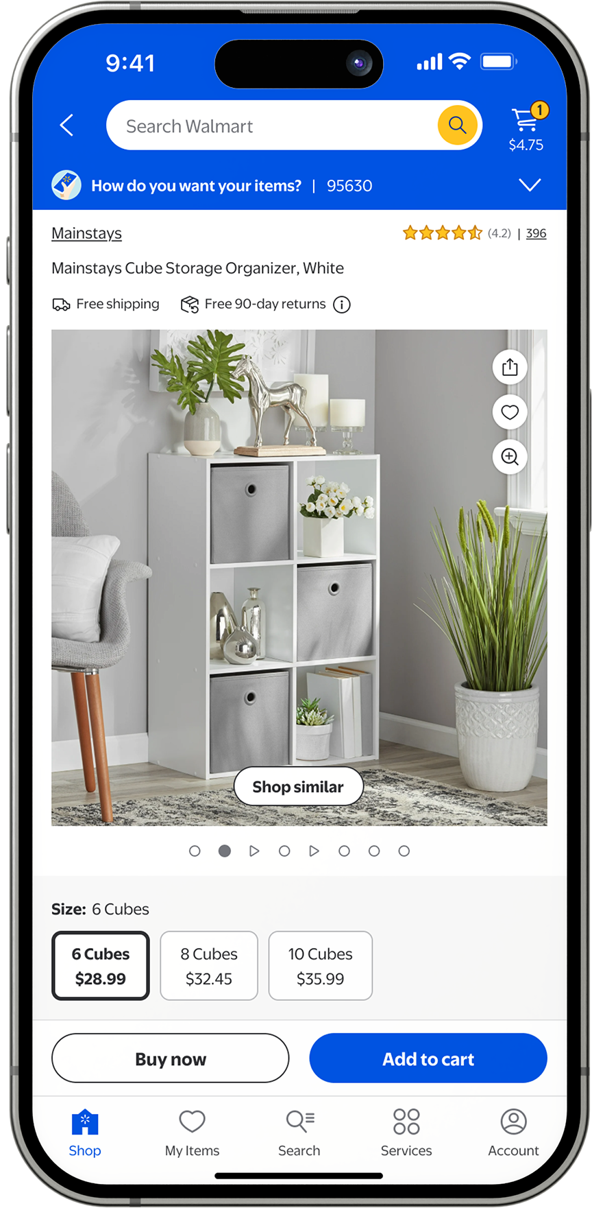

FOURTH ITERATION & A FUTURE LAUNCH
This iteration is currently being tested on Walmart platforms. Check back for updates!
We believe this design achieves the right balance. The “Shop Similar” call to action is intentionally subtle and lightweight, crafted to avoid distracting customers from their main goal of exploring the selected item. Instead, it provides a quick, low-friction way to discover alternatives—helping keep customers engaged rather than leaving the experience altogether. This test will go live in the Walmart app soon, and we will continue to share updates as results come in. The team is optimistic about gaining approval to launch this new iteration in June 2025.