WEB CASE STUDY
Publix Customer Perks
Testing & Improvements
OVERVIEW
The Publix customer perk journey required thorough research, testing, and enhancement.
Publix Super Markets, a beloved grocery chain throughout the Southeastern United States, is renowned for its friendly employees, spotless stores, iconic fried chicken, and devoted customer base. When customers create online accounts, they receive personalized emails highlighting perks such as discounts on their favorite products and exclusive birthday rewards. During testing of other site features, I noticed that many users were unclear about what Publix perks actually entailed, which inspired me to investigate further and improve the overall perks experience.
ROLE & DETAILS
Lead Product Designer
User Testing, Wireframing, Prototyping, Documentation, Visual QA
Team
1 Product Designer, 1 Product Owner,
2 Engineers
Timeline
March 2021 – May 2021
Tools
Figma
THE CHALLENGE
"How might we make the customer perk journey more informative and user-friendly for every customer?"
After conducting several user tests with Publix.com account holders, I uncovered a recurring challenge: many users didn’t fully grasp the benefits linked to their online accounts. Recognizing the breadth of valuable perks available, I committed to testing and improving the experience to ensure every shopper could easily access and enjoy the full value of their Club Publix membership.
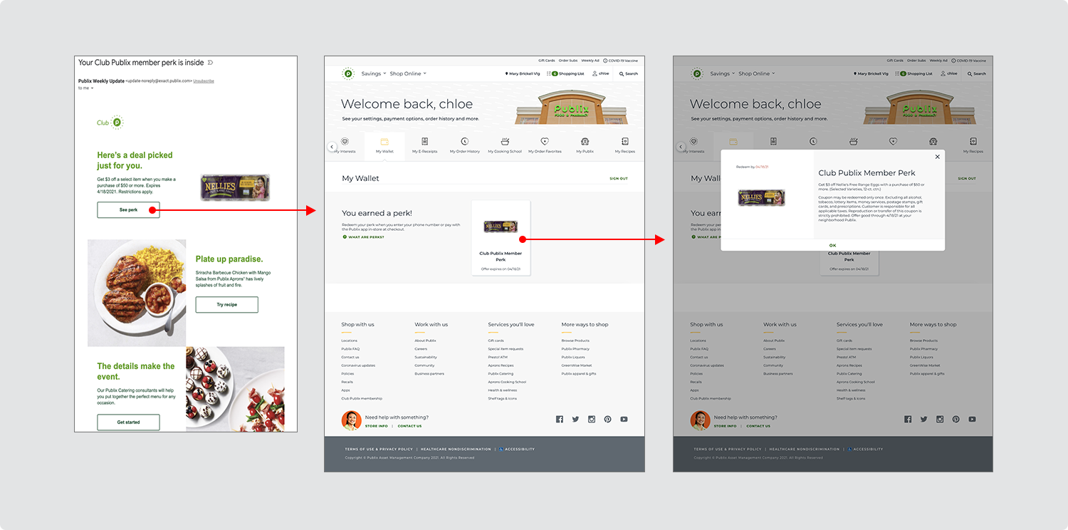
USER TESTING
I tested the current experience to hear directly from our shoppers.
Using the UserTesting platform, I conducted in-depth sessions with 15 Publix account holders to better understand the full perks experience from start to finish. Participants were guided through the process of receiving a perk email, accessing it on the website, and exploring the details in a modal window. Throughout the sessions, I asked users to share any points of confusion or frustration, as well as ideas for improving the overall journey. Nearly all participants called for a more streamlined experience and clearer educational touchpoints to help them better understand and engage with their Club Publix perks.
Some notable soundbites from user testing included:
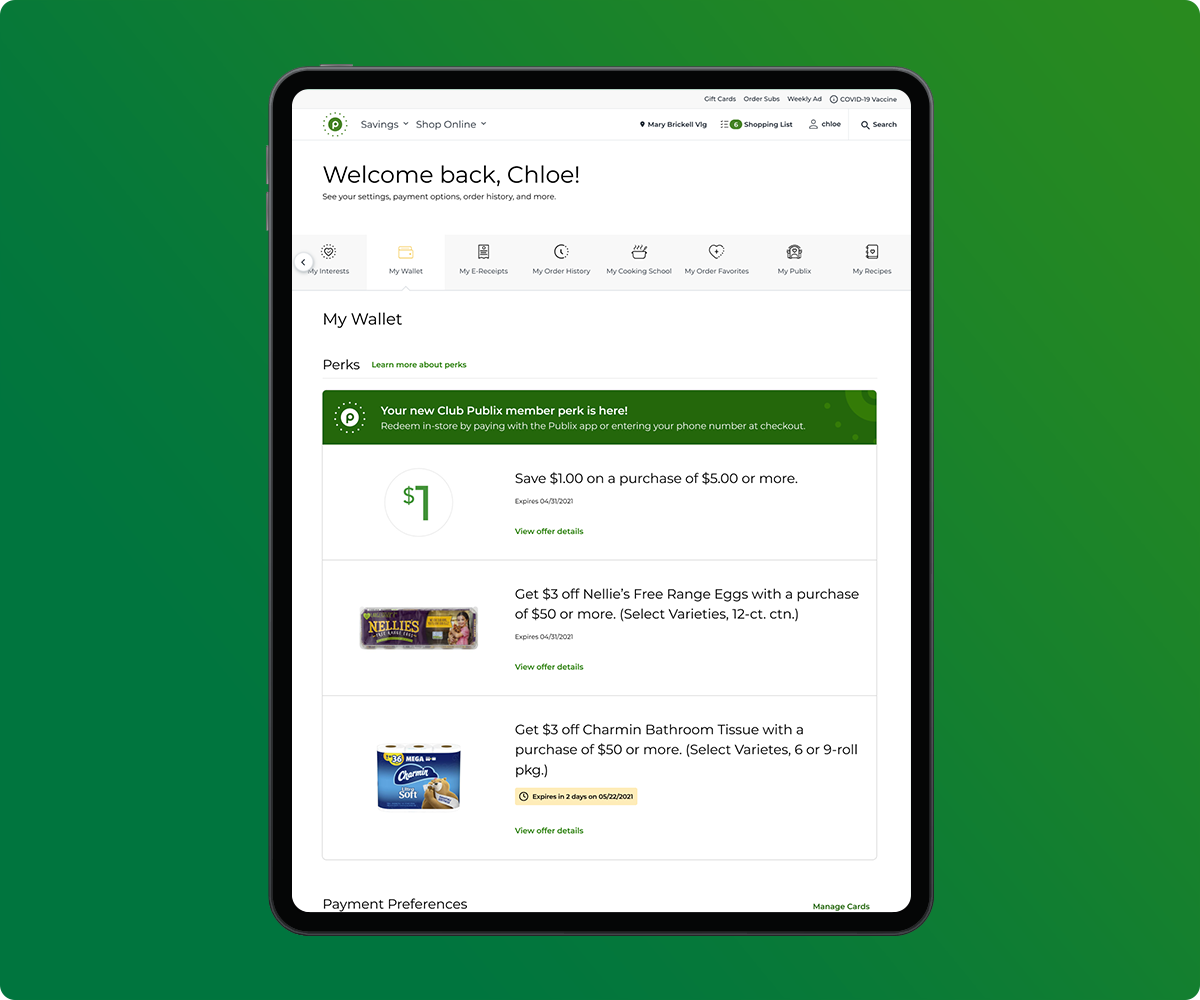
On the effectiveness of the wallet page, one participant noted, “From the previous page, I understood this was supposed to be $3.00 off a specific item if I spend $50.00 or more. But I don’t see that information here at all."
When asked how they would redeem the perk, another user responded, “That’s a good question—I was wondering the same thing.” This emphasized the need for more intuitive and accessible instructions around perk redemption.
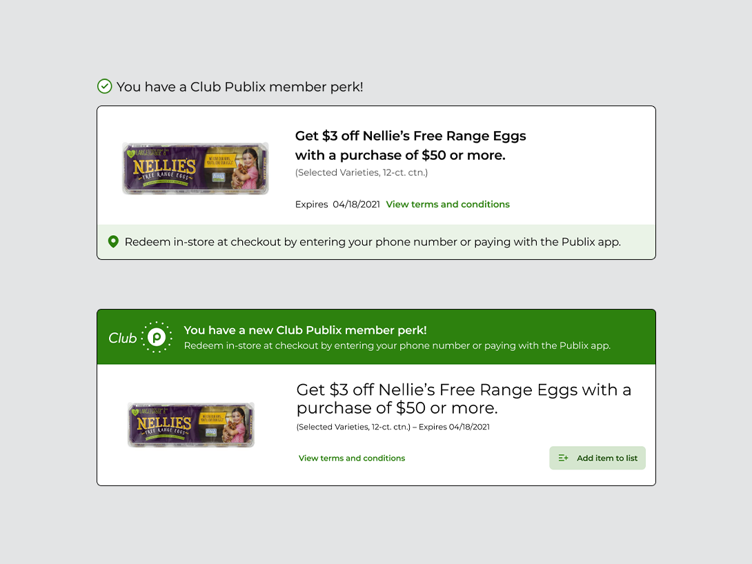
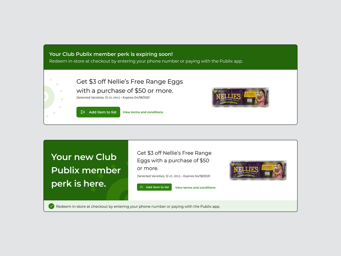
WIREFRAME ITERATION
It was essential to not only explain what the perks are, but also guide users clearly on how to redeem them.
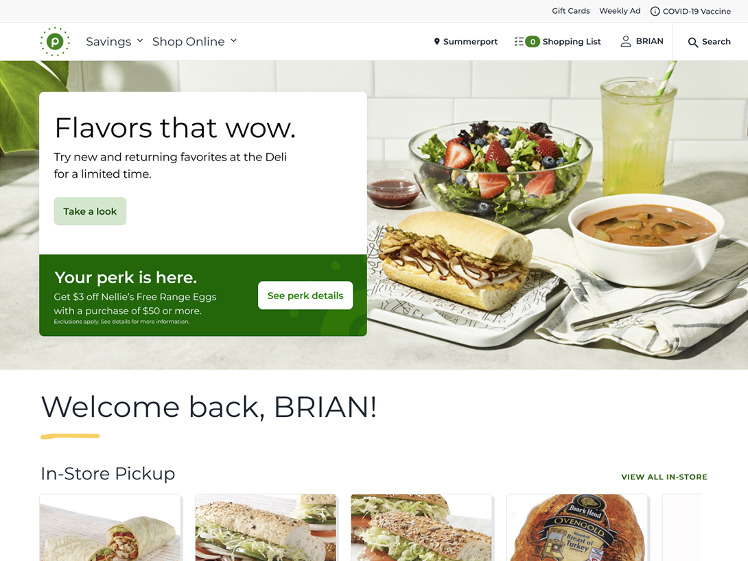
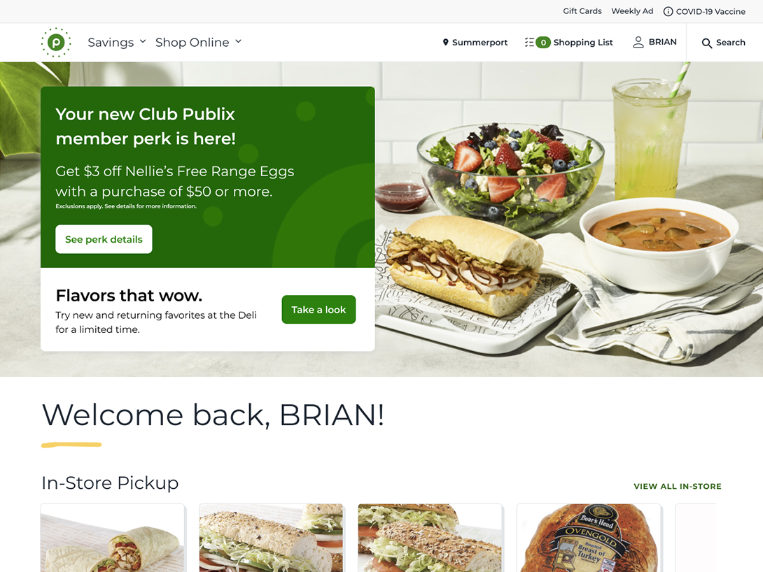
To create a seamless redemption experience, I redesigned the perk card to combine a clear explanation of the offer with simple, actionable instructions. A bold headline—“Your Perk Is Here!”—immediately drew attention, while step-by-step guidance ensured users knew exactly how to redeem it. I enhanced the visual hierarchy by adding generous white space, increasing font sizes for readability, and incorporating vibrant imagery that brought the perk to life—making the experience both intuitive and engaging.

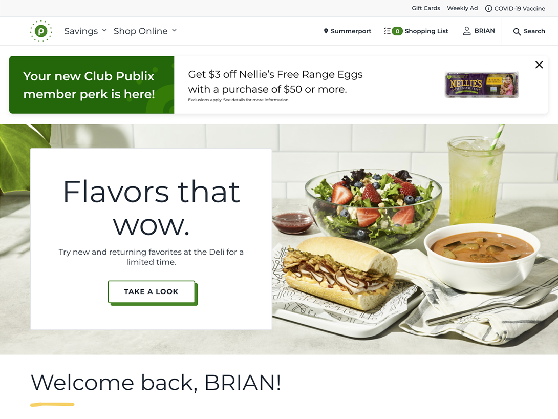
ADDING ADDITIONAL CONTEXT
I explored different scenarios to better educate customers on the benefits of perks.
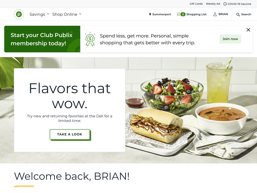
When a perk was active, it would replace the homepage hero section, which posed a challenge from a marketing standpoint. To solve this, I designed a solution that allowed both the hero and the perk to coexist, preserving valuable marketing space while still showcasing the perk. I also considered edge cases—like customers who weren’t enrolled in perks or didn’t yet have an online account—and explored how to guide them into the experience. The result was a targeted banner notification that educated, encouraged, and smoothly directed users to opt in and sign up, making the experience more inclusive and conversion-friendly.
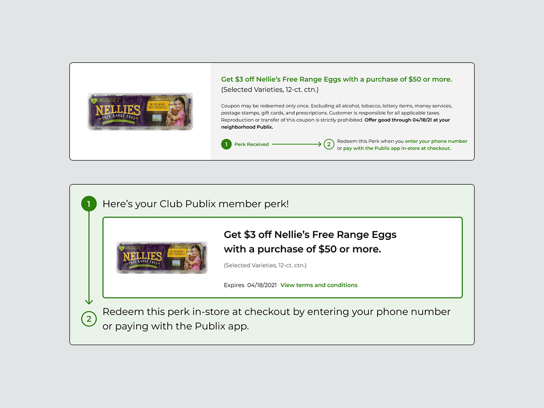
THE SOLUTION
Customers now have all the information they need in one place.
Customers now enjoy a more streamlined perk experience, with all relevant information and redemption instructions clearly displayed within a single, unified card—eliminating the need to open a separate modal. Looking ahead, we’re exploring new features like the ability to add perks directly to shopping lists, making it easier for customers to remember and redeem them. We’re also planning to introduce thoughtful empty states in the wallet, guiding users who don’t yet have perks to learn more and easily enroll. As more perks have rolled out throughout 2021, it’s been incredibly rewarding to continue improving this experience and deliver added value to our customers.