iOS/ANDROID APP CASE STUDY
Universal Orlando Resort's
New Interative Map
OVERVIEW
The map on Universal’s mobile app was missing key features and lacked a cohesive design, failing to meet the expectations of both first-time visitors and returning guests.
With over a million monthly active users, the Universal Orlando mobile app serves as an essential digital companion for both locals and international visitors exploring Universal Orlando Resort in Florida. Central to the app is its interactive park map, a vital tool that guides guests to attractions, highlights dining options, and supports seamless navigation throughout their visit. Despite its importance, the map had significant shortcomings that called for thoughtful, detail-oriented improvements to elevate the guest experience.
ROLE & DETAILS
Lead Product Designer
Competitive Research, Wireframing, Prototyping, User Testing, Documentation
Team
1 Product Designer
1 Product Owner
13 Engineers
Design Timeline
August 2021 – March 2022
Launched: February 2024
Tools
Axure, Sketch, Invision
THE CHALLENGE
"How might we design a unified, intuitive map experience that lets guests easily view all categories, search for attractions, and switch between park maps—while maintaining an elegant, accessible interface for a diverse range of visitors?"
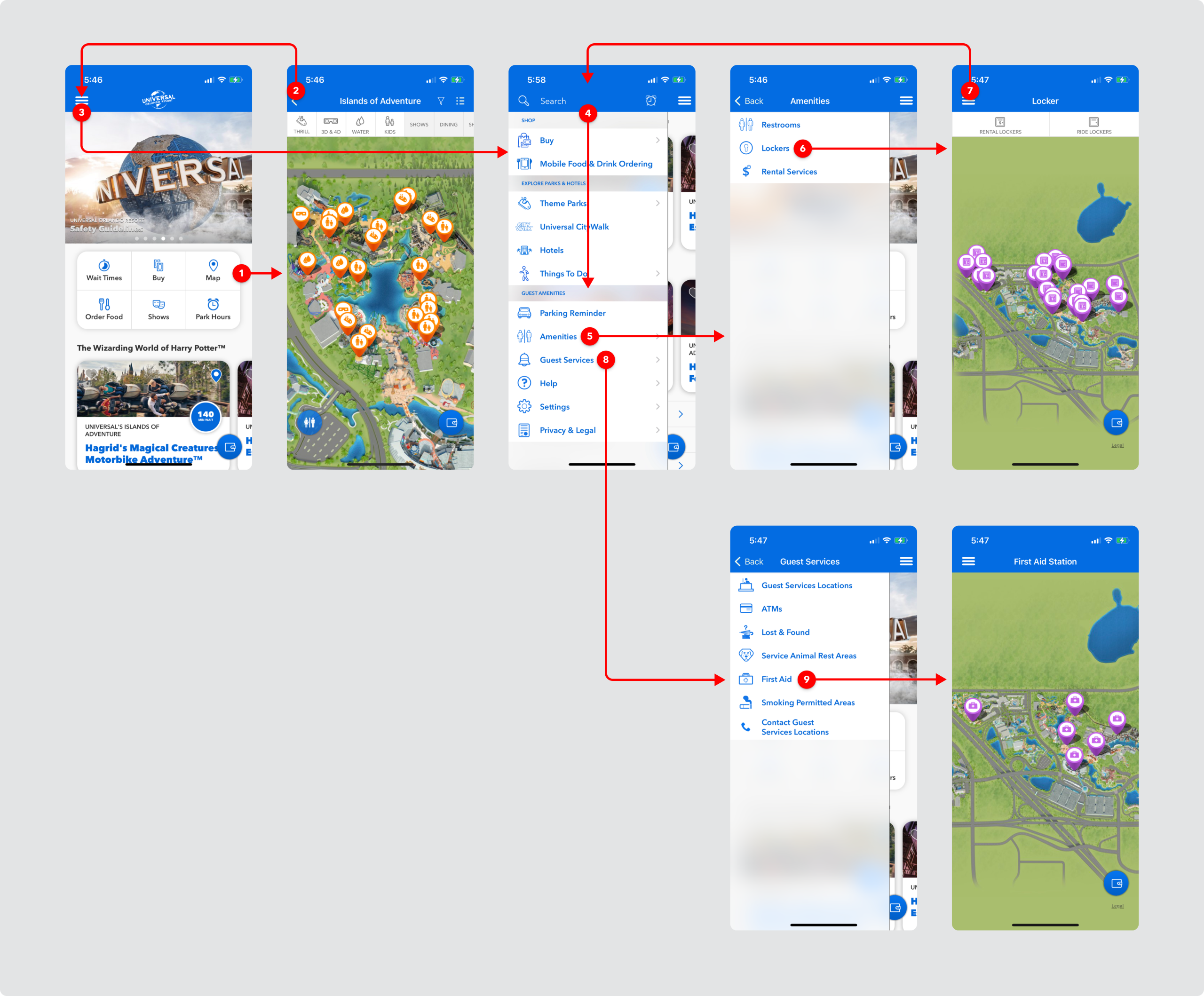
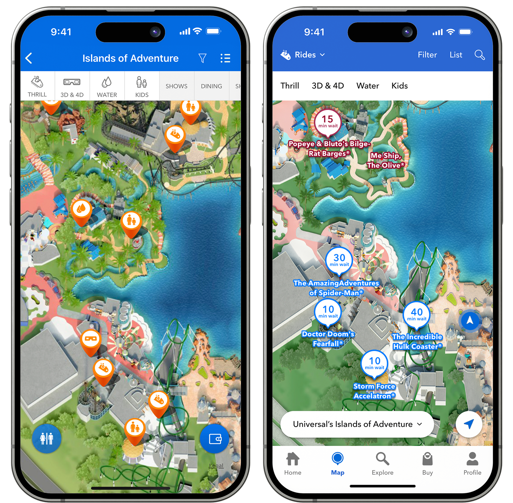
The existing map experience on the Universal Orlando Resort mobile app was fragmented and inconsistent. Popular categories like rides, shows, shopping, and dining were separated from essential amenities such as ATMs, guest services, and first aid. As shown below, navigating between categories—such as switching from rides to lockers—required multiple steps, leading to a frustrating user journey. Adding to the confusion, filtering varied by category: ride sub-filters were toggled on and off by default, while other categories like shows, dining, and shopping required users to navigate an advanced filter menu. In response, the product team aimed to streamline and elevate the experience. Key goals included creating a unified interface for all map categories, simplifying navigation between park areas, and introducing an intuitive search function—delivering a more seamless, guest-friendly experience.
COMPETITIVE RESEARCH
I began by exploring established patterns within the highly competitive landscape of mobile map experiences.
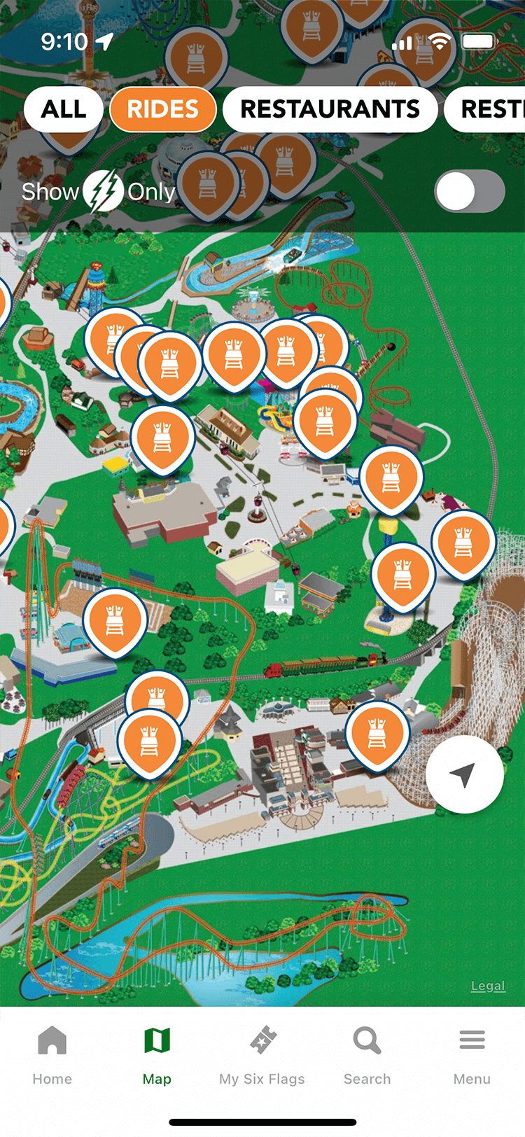
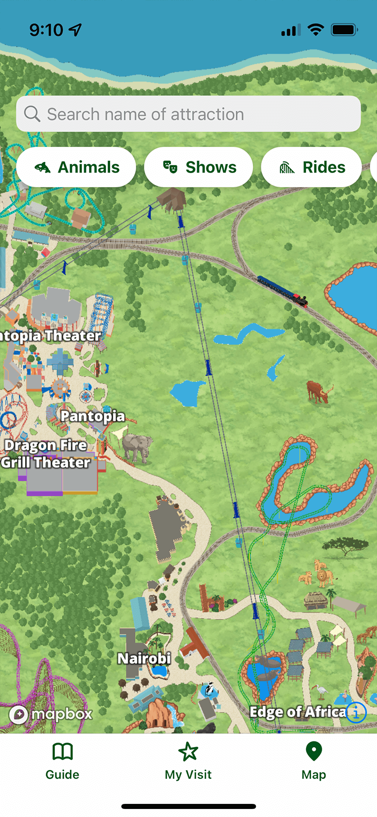
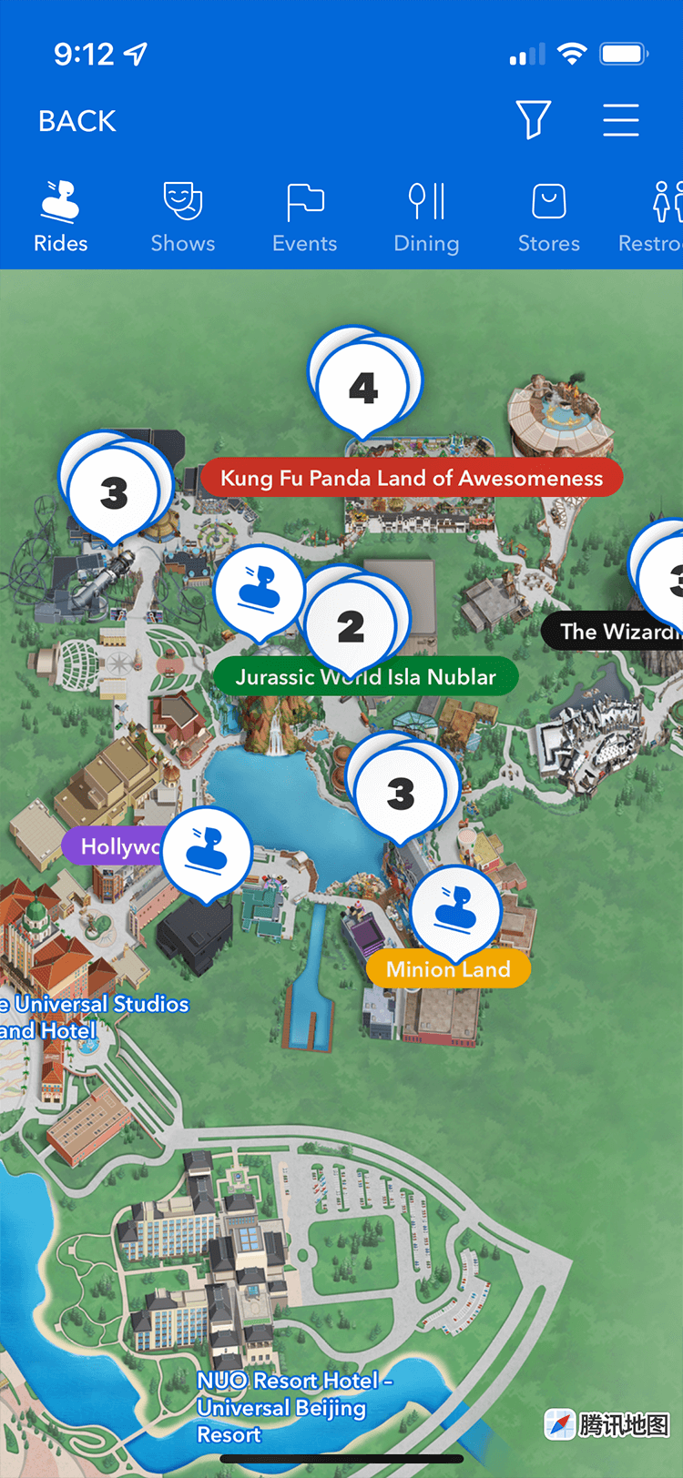
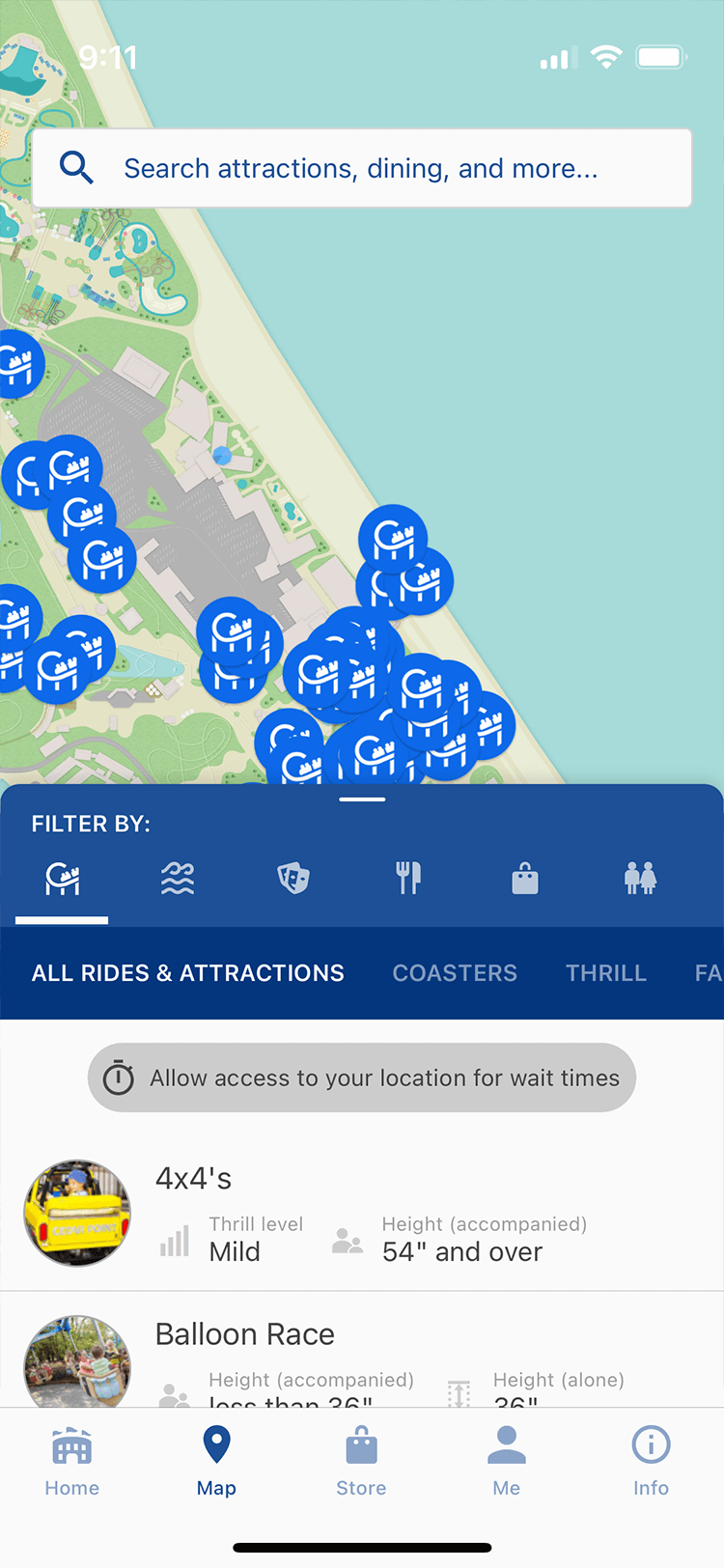
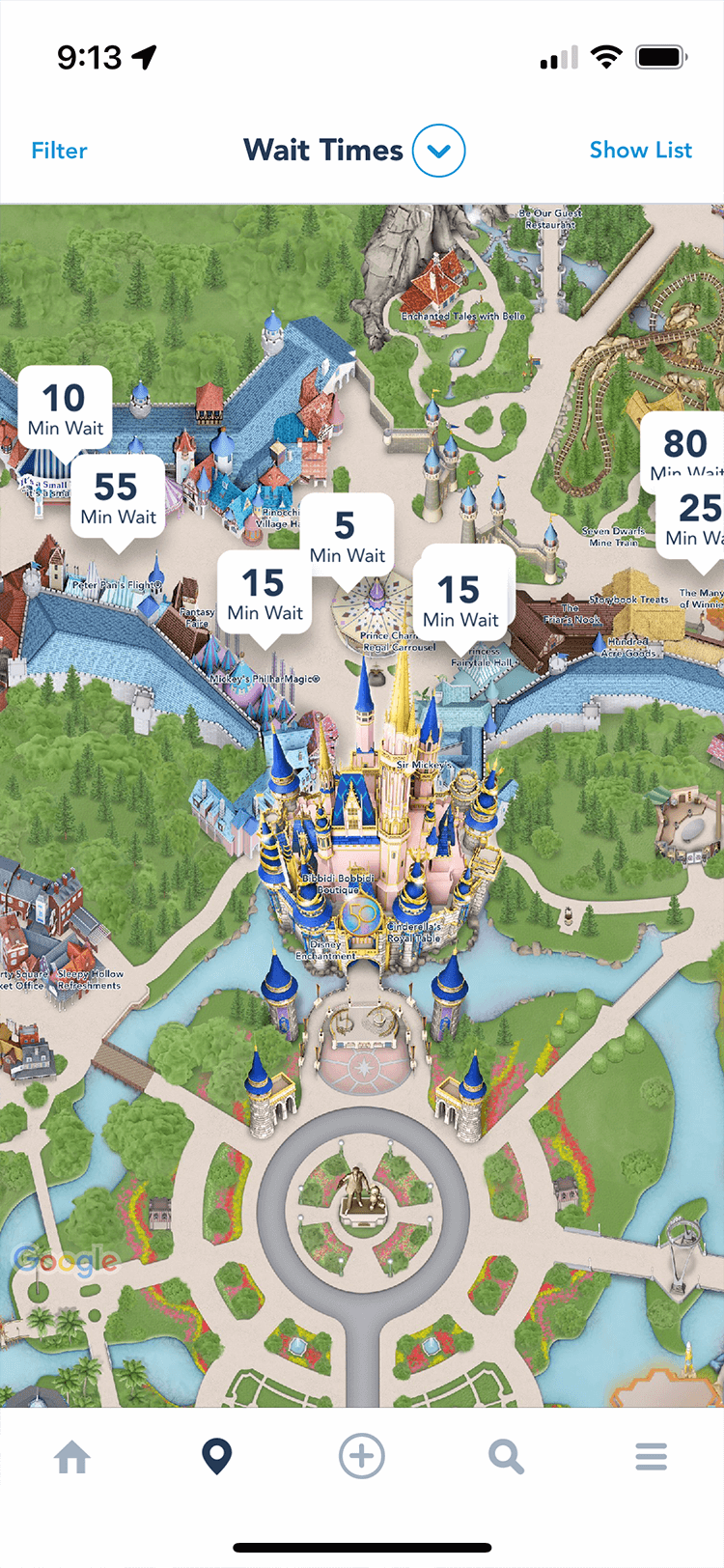
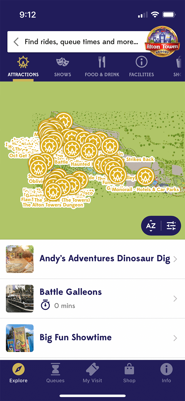
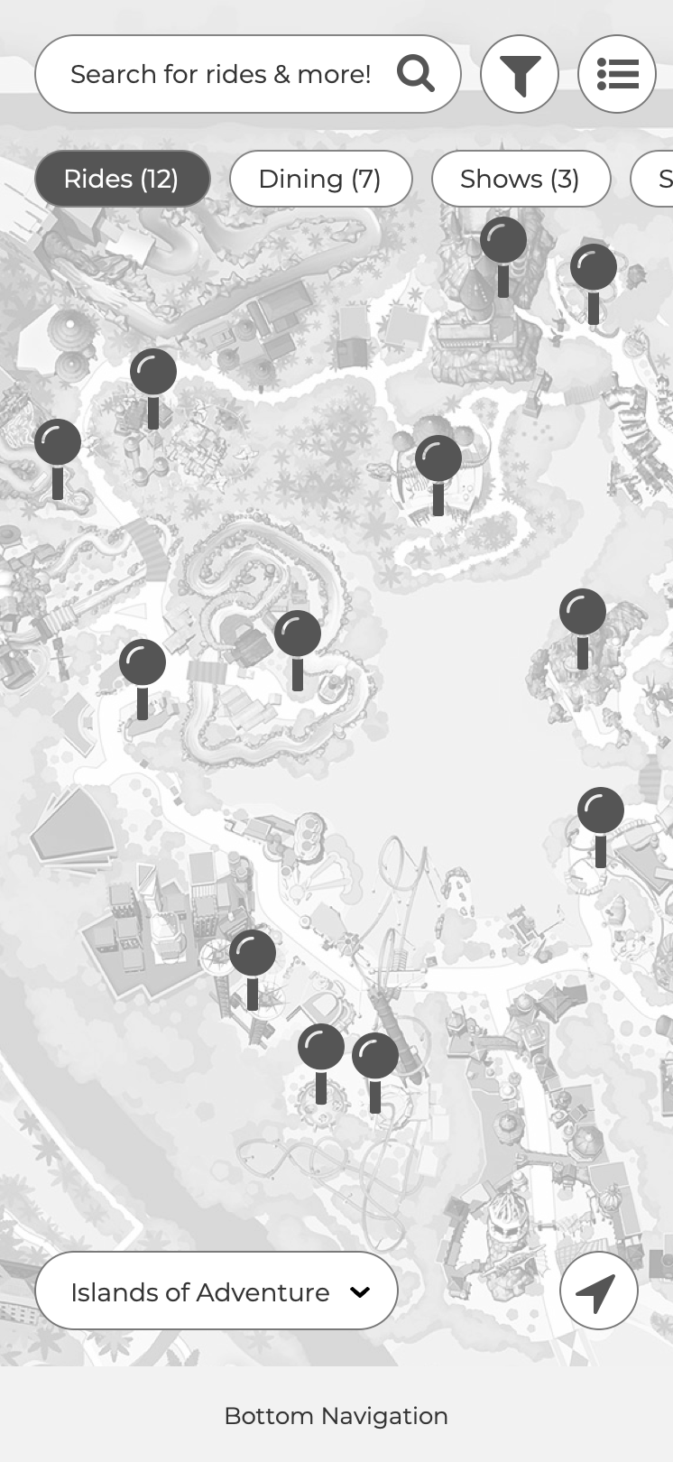
Navigation apps are now indispensable on smartphones. Knowing that many guests were already familiar with apps from competitors like Disney, Busch Gardens, SeaWorld, and Cedar Point, I started my research by analyzing their experiences to identify common design patterns. After reviewing about eight leading theme park apps, clear trends emerged—such as floating category pills, half-sheet list views, and primary controls positioned at the top of the screen. My goal was to integrate these familiar patterns into the new Universal map experience, creating a seamless, intuitive interface that feels both consistent and easy to use for our guests.
WIREFRAMES & USER TESTING
After developing multiple wireframes, I tested them with users to identify which designs resonated best and delivered the strongest performance.
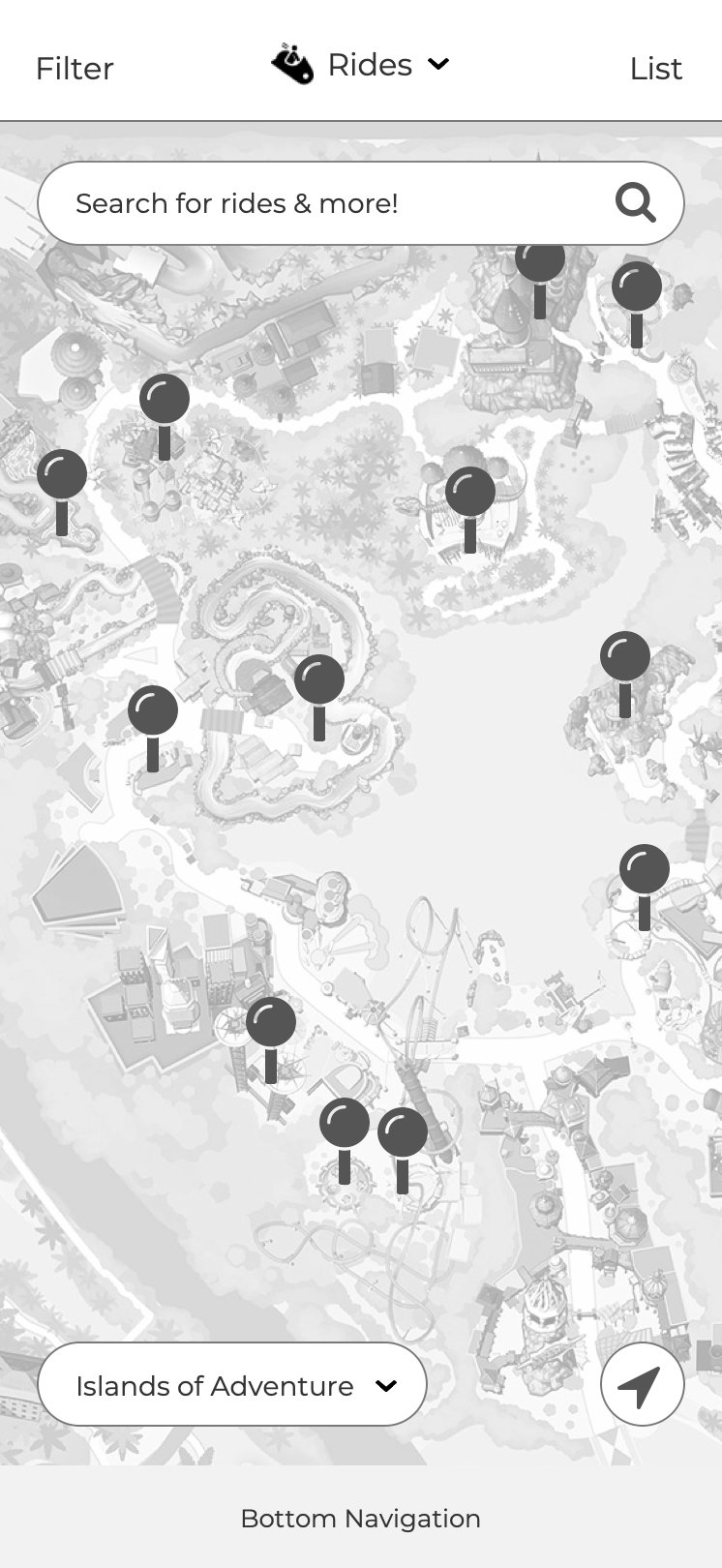
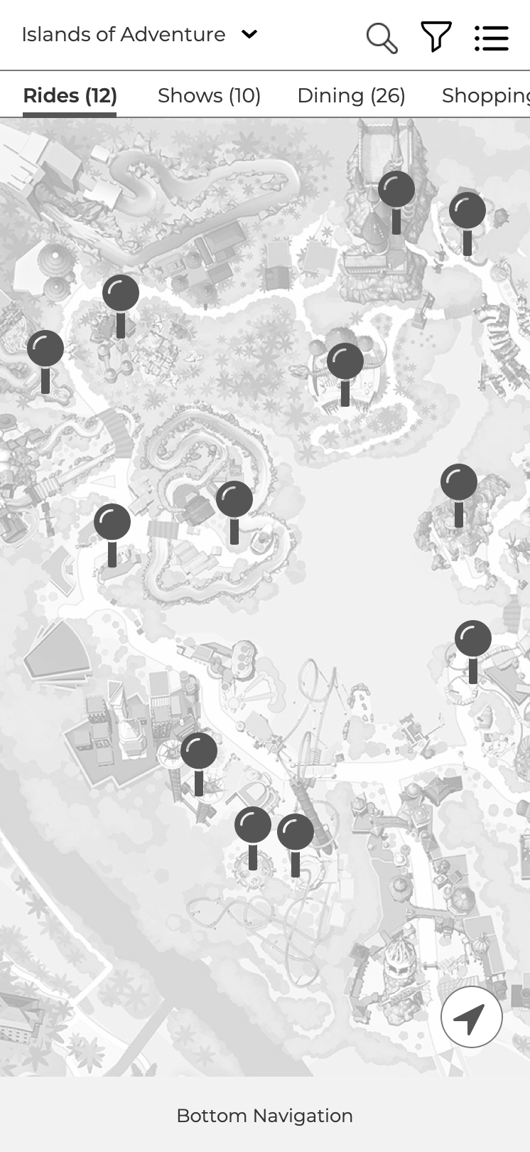
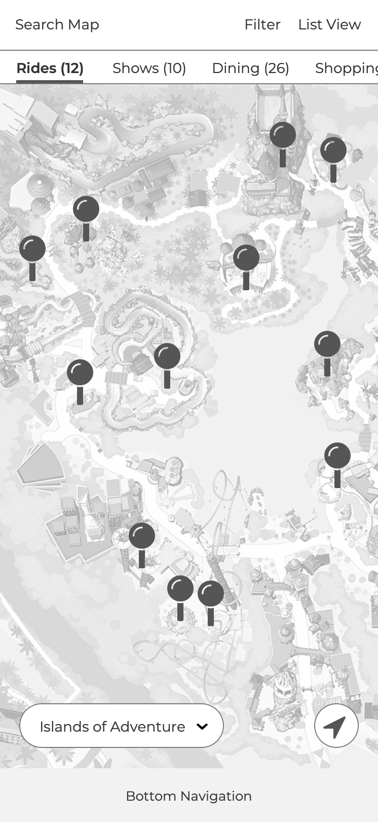
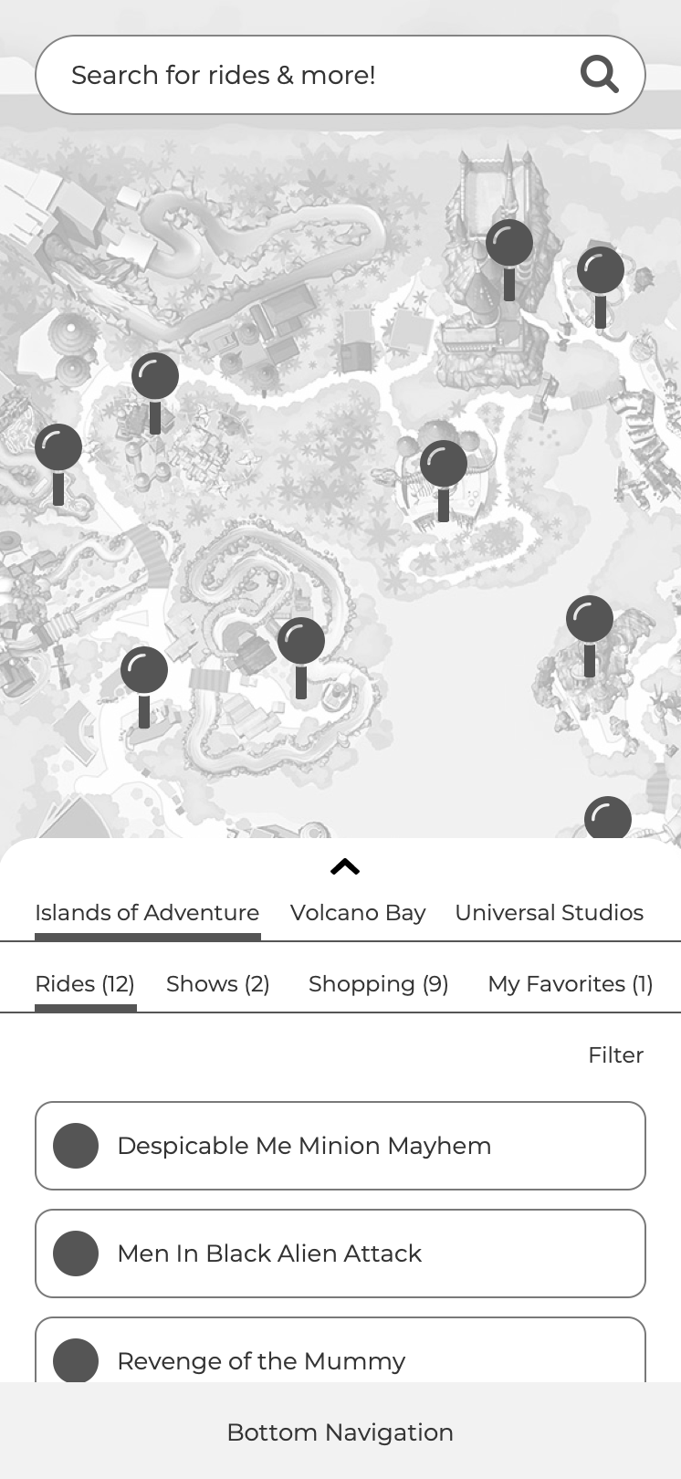
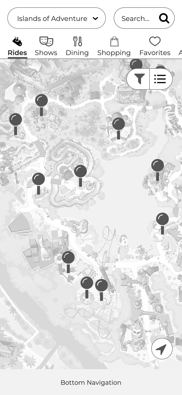
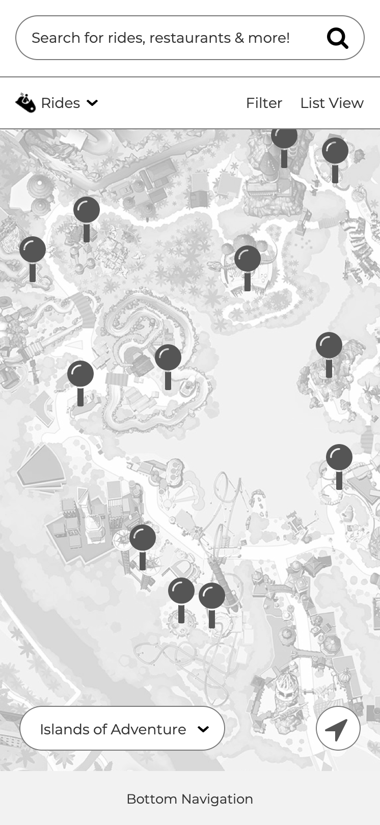
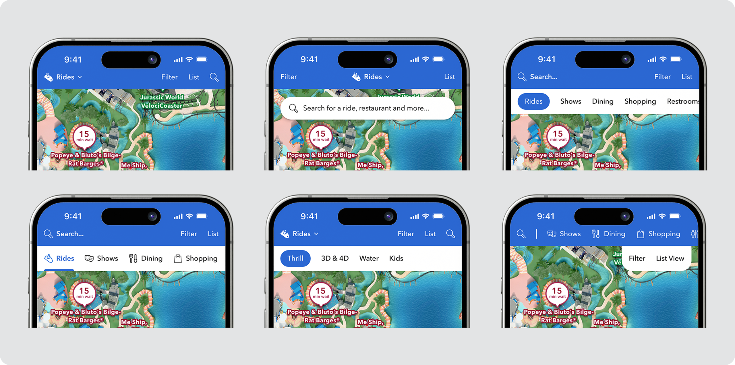
Building on established market patterns, I created eight distinct wireframes to explore a broad range of design directions. I then created fully functional prototypes and tested them with 10 participants using UserZoom.com. Participants were asked to complete key tasks such as locating the list view, applying filters, and searching for attractions. The results revealed a clear preference for three concepts: the single-category layout with a prominent search bar, the floating category pills design, and the split map and list view. With this feedback in hand, I moved into the next phase, creating higher-fidelity designs for further testing and refinement.
LOW-FI DESIGNS & USER TESTING
Conducting in-person user testing with park guests required low-fidelity designs to allow for quick feedback and iteration.
This was the most exciting phase—an all-day user testing session with 10 park guests at Universal’s Islands of Adventure. I started by discussing their current experiences with the mobile map to identify key pain points. Then, I guided each guest through three interactive prototypes, differing mainly in whether multiple categories were shown simultaneously or one at a time. During testing, I sat back and carefully observed how guests interacted with tasks like switching categories, applying filters, navigating the list view, searching for attractions, and switching parks. By day’s end, preferences were evenly split between the first two designs, indicating the final design direction would need to be decided collaboratively with engineering during the next phase.
DESIGN ITERATION
With two potential category approaches identified, the design iteration process was underway.
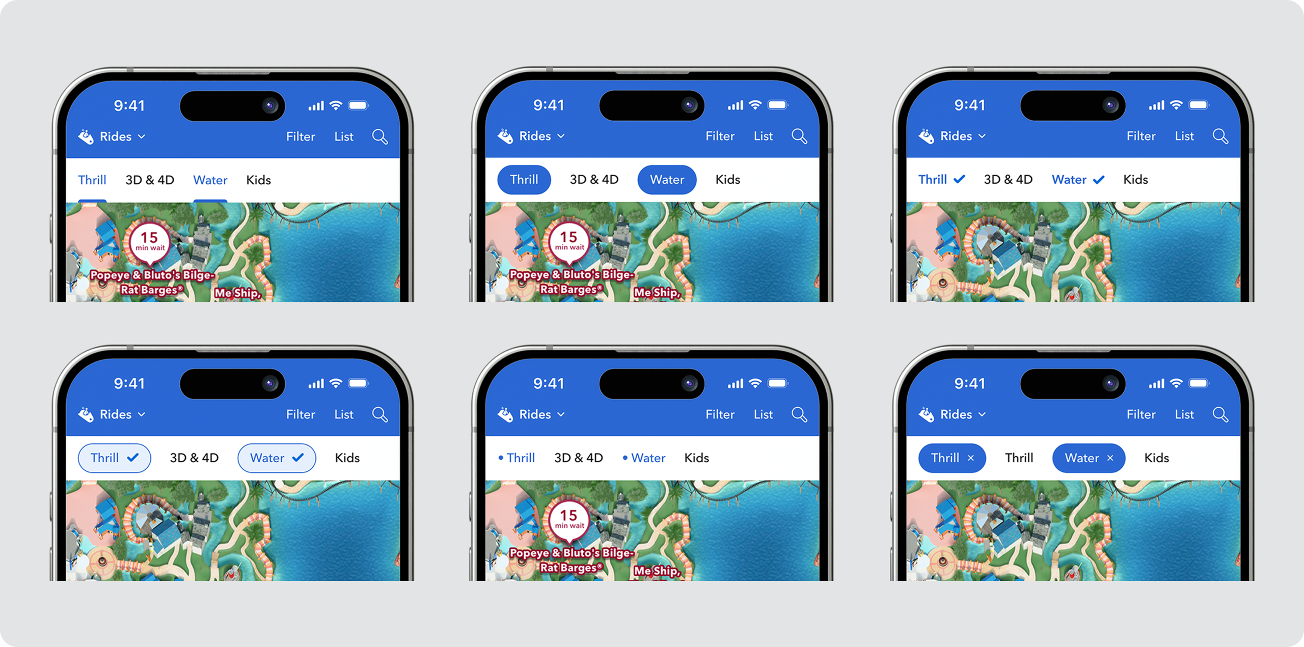
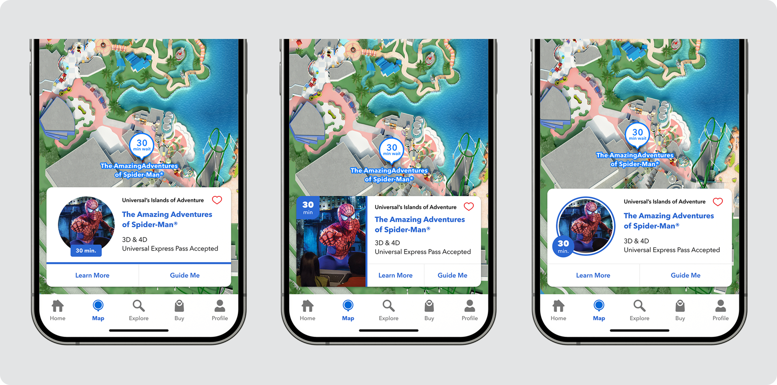
I had multiple opportunities to experiment with various header designs to identify the most intuitive and effective approach. Throughout this phase, I collaborated closely with product and engineering teams to ensure alignment and avoid suggesting solutions that were not technically feasible. I concentrated on key actions such as category selection, sub-filter selection, list view navigation, filtering, and searching, with the goal of integrating all these elements seamlessly while establishing the right emphasis for each. Taking into account product and engineering constraints such as the search function not being ready for launch, I designed the interface to perform smoothly whether or not that feature was available. After assessing character counts and usability, the single category view clearly stood out as the preferred option. Additionally, we improved the experience by enabling guests to access all available sub-filters for every category without relying on an advanced filter menu, enhancing the system guests were already familiar with. I really enjoyed this iterative process, and my graphic design background was invaluable. It allowed me to explore numerous design variations such as the point-of-interest cards shown here, ultimately crafting the best possible experience for our guests.
THE NEW MAP EXPERIENCE
I created an experience that felt familiar to users while significantly enhancing functionality.
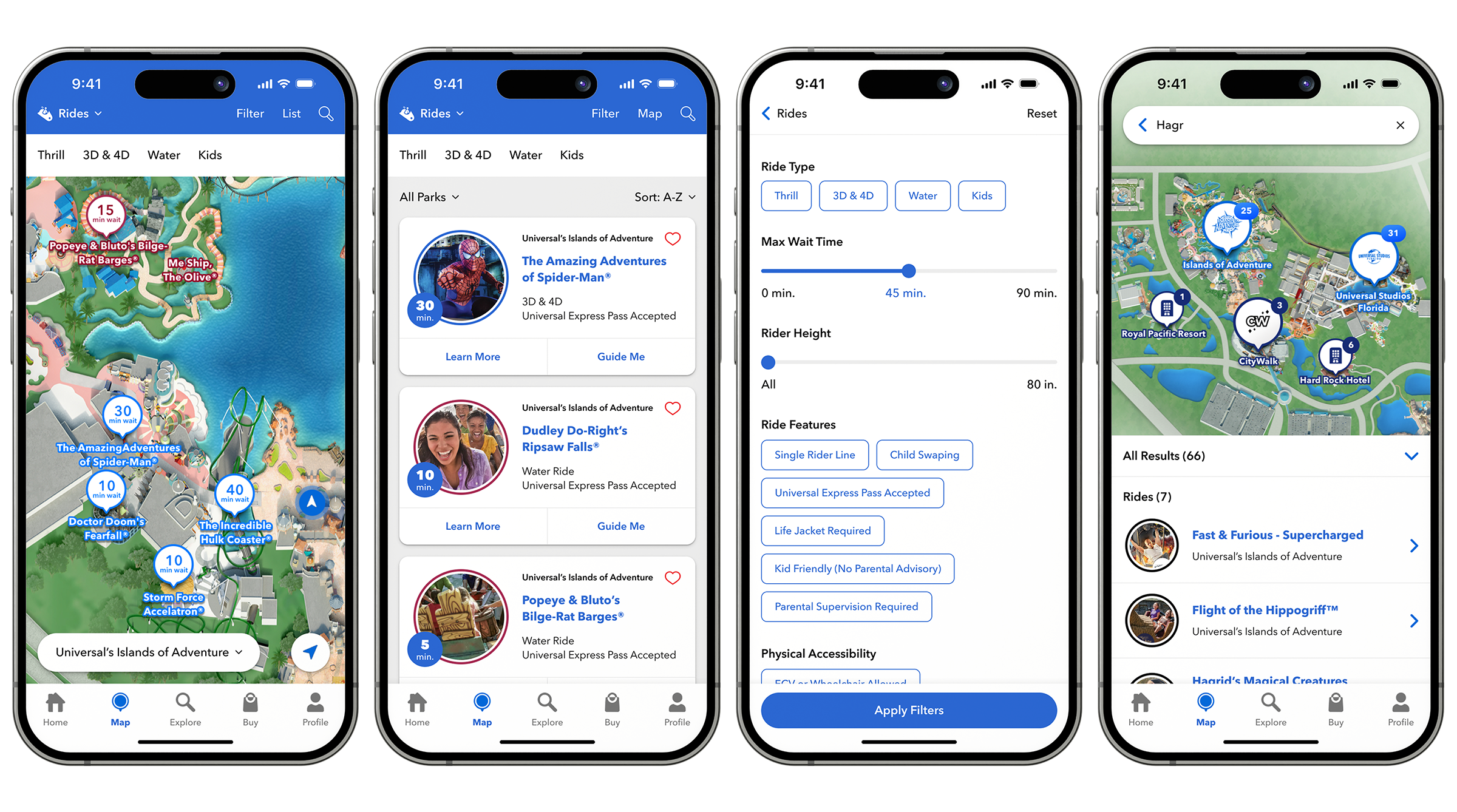
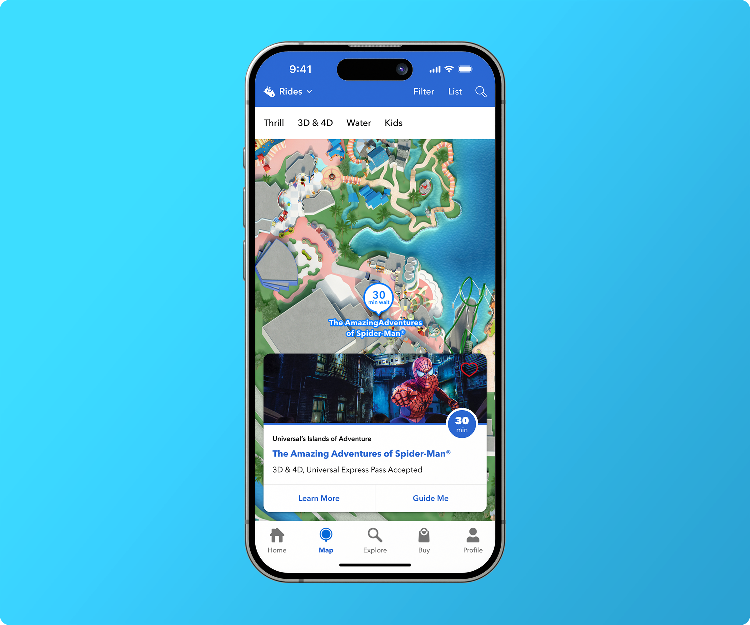
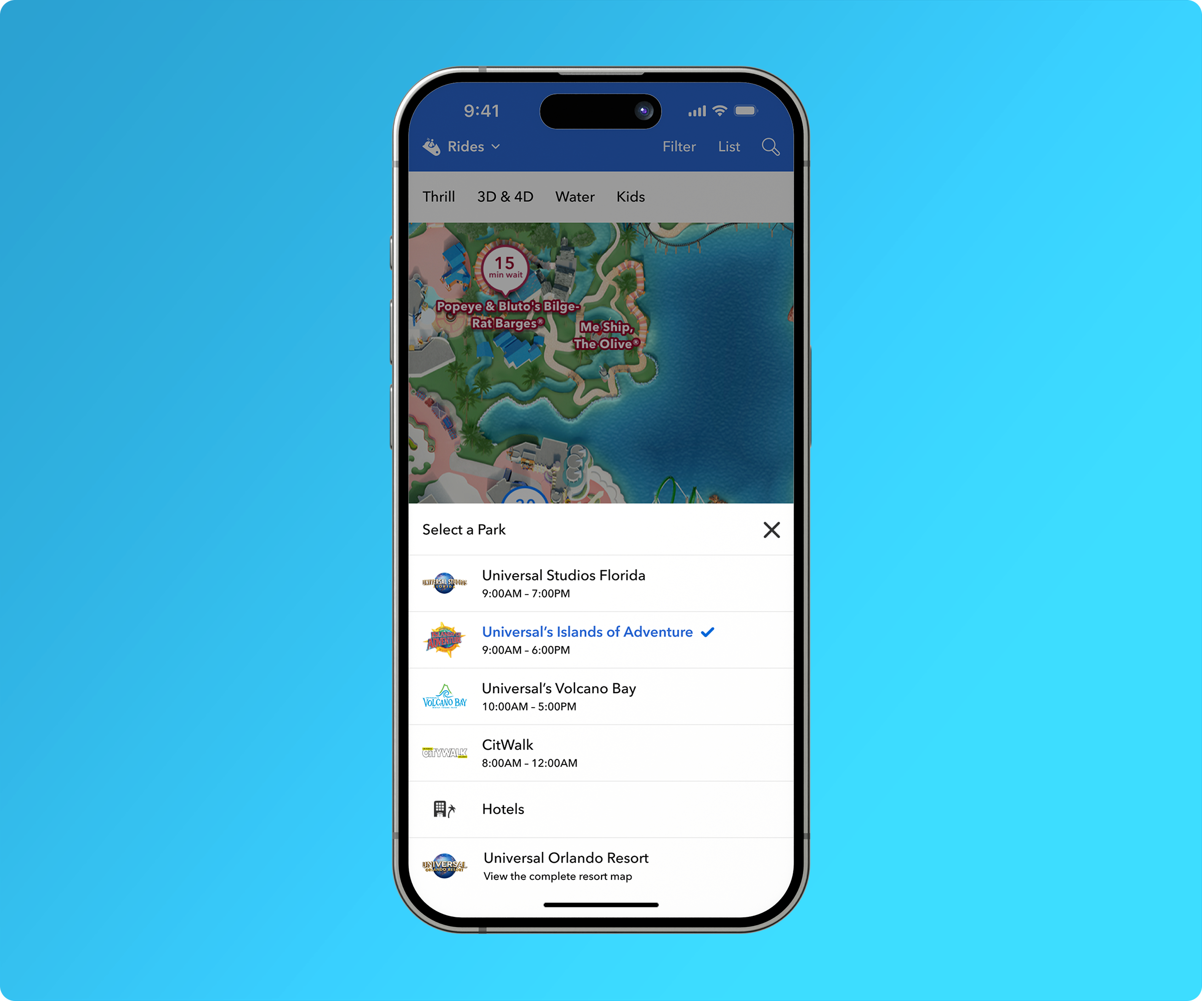
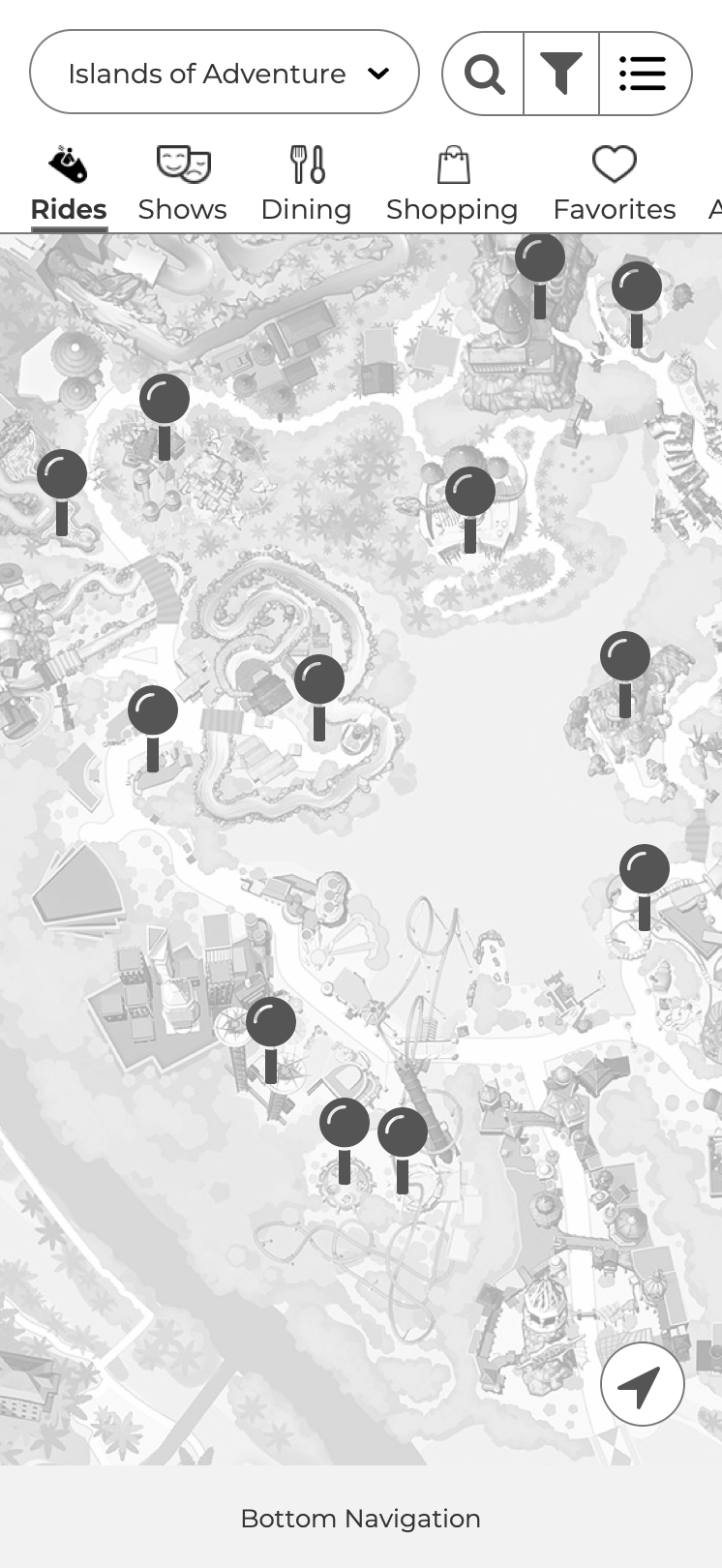
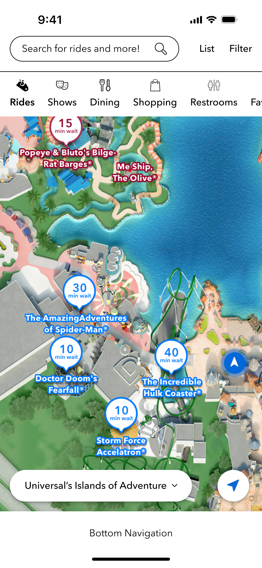
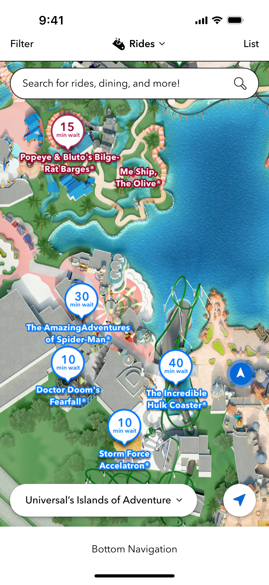
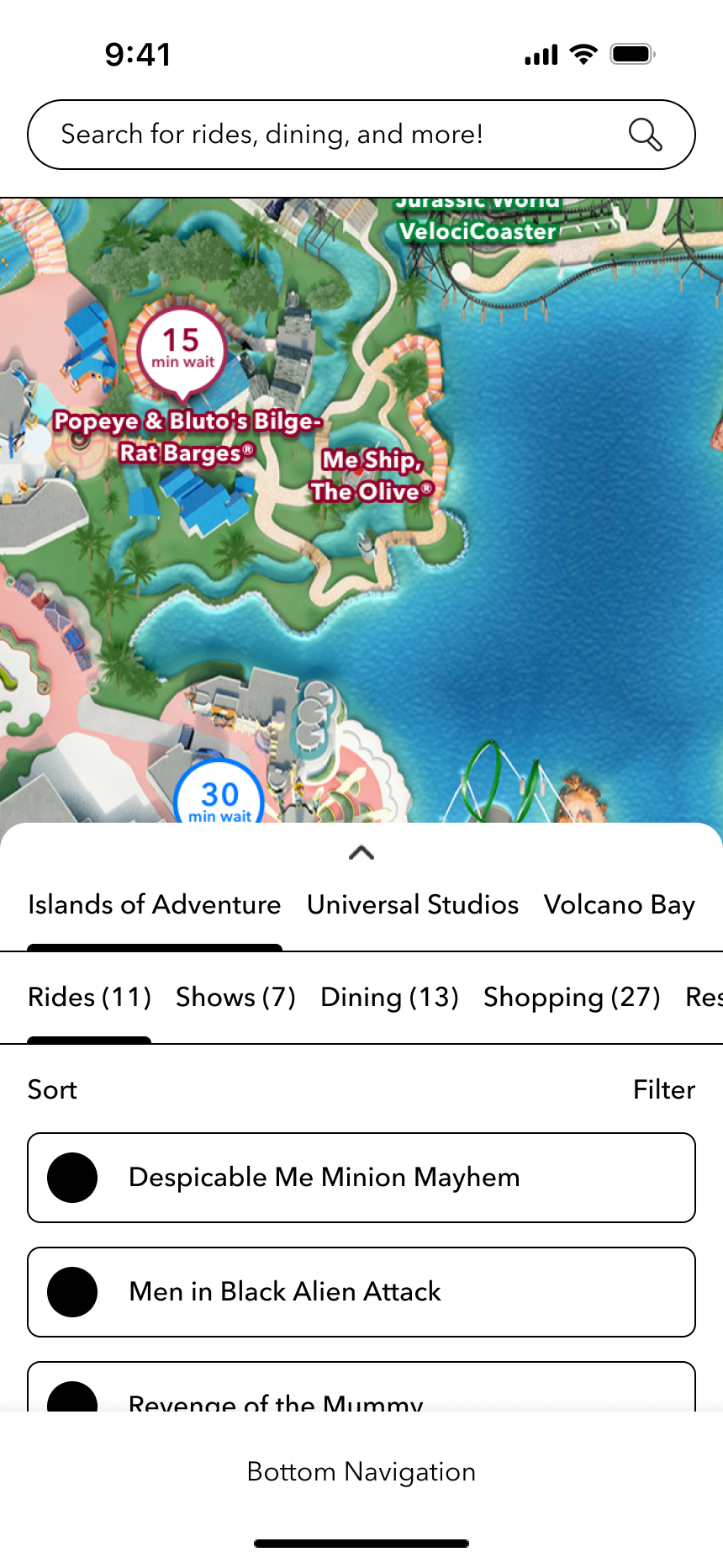
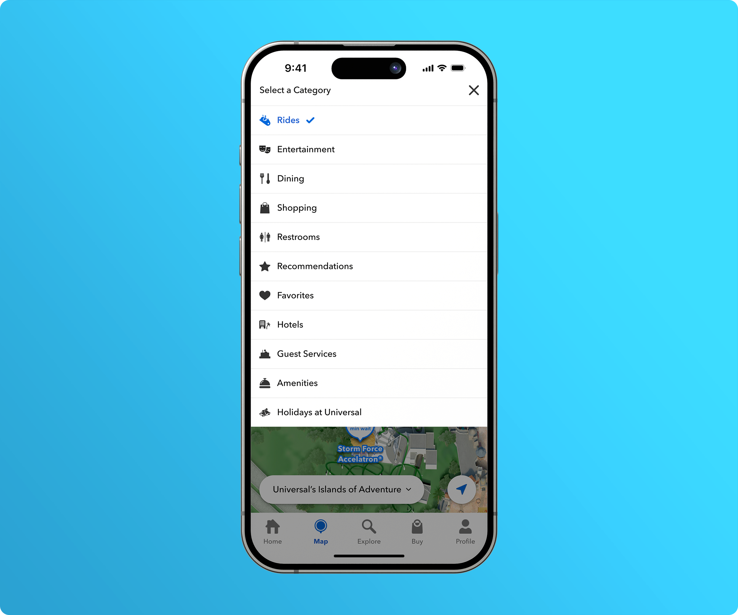
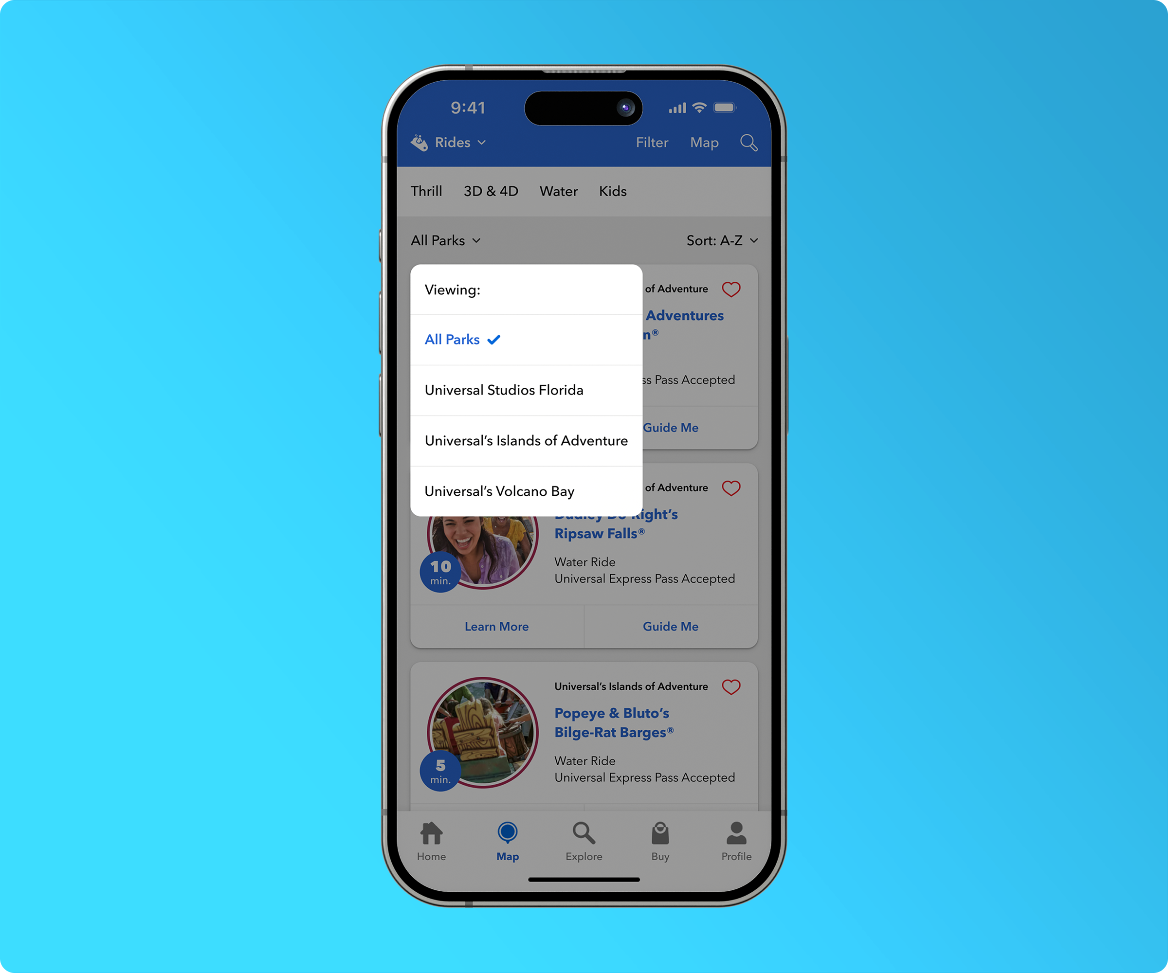
By adding tabbed navigation to the mobile app, we freed up valuable header space to showcase our biggest improvement: the category selector. This feature lets guests instantly choose any category they want—whether rides, shops, first aid, animal service rest areas, or more—removing the need to navigate through multiple screens to find what they need. Important details like point-of-interest labels and attraction wait times now appear directly on the map, giving guests essential information at a glance. Each category includes a sub-filter bar for quick and convenient filtering. We also introduced a unique search experience and added a park toggle at the bottom of the screen, allowing guests to switch seamlessly between park maps without leaving the map interface.
THE NEW SEARCH EXPERIENCE
Now guests can discover more by searching directly on the map.
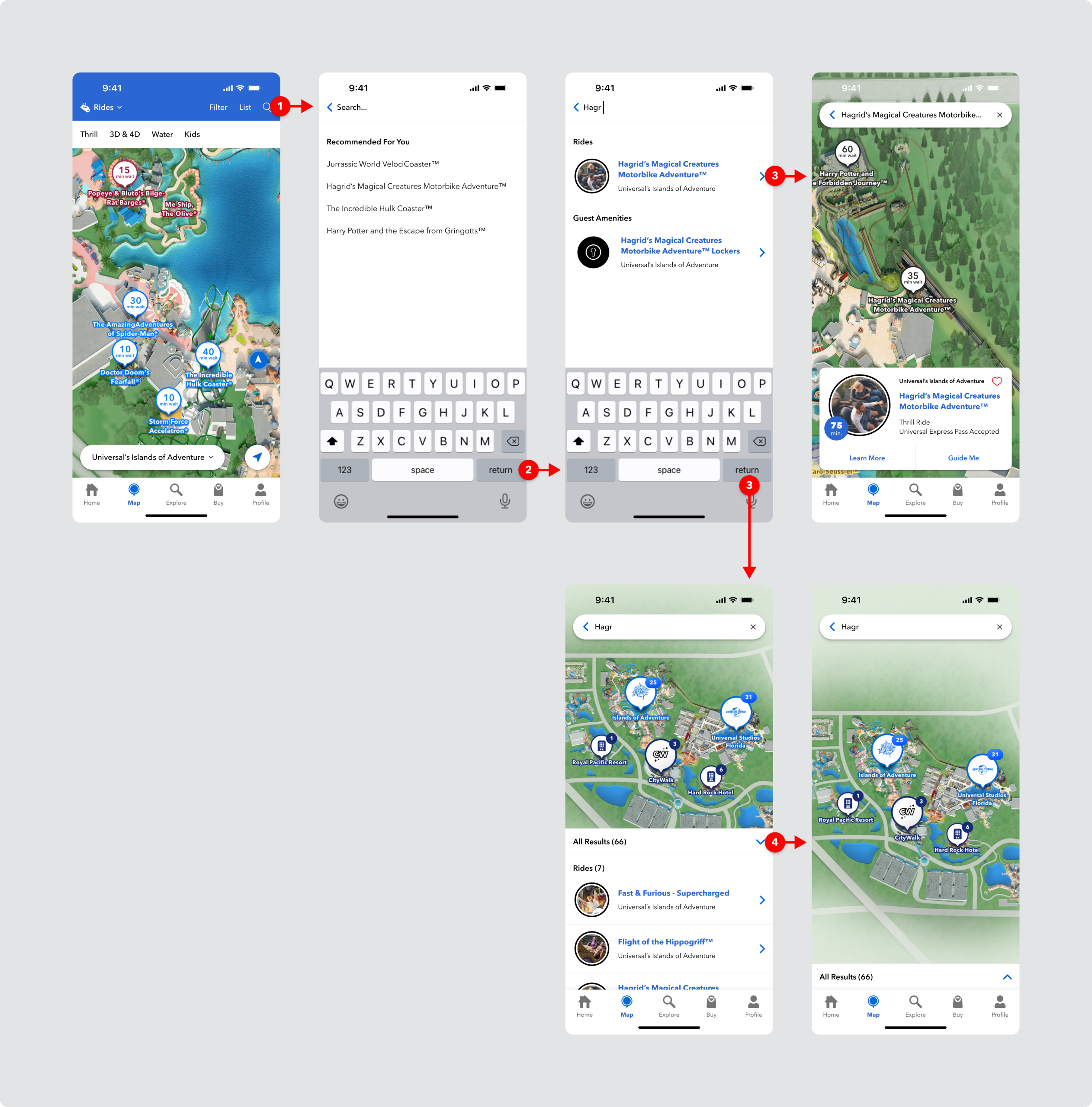
During several user testing sessions, we asked guests if they preferred choosing from recommended search results or conducting open-ended searches to explore freely. Guests clearly wanted both options, so we designed the experience to include them. In the new flow, guests see recommended search choices as soon as they enter the search feature, while also having the freedom to type any search term and explore results across the entire resort.
THE NEW FILTER EXPERIENCE
The filter also required a significant overhaul.
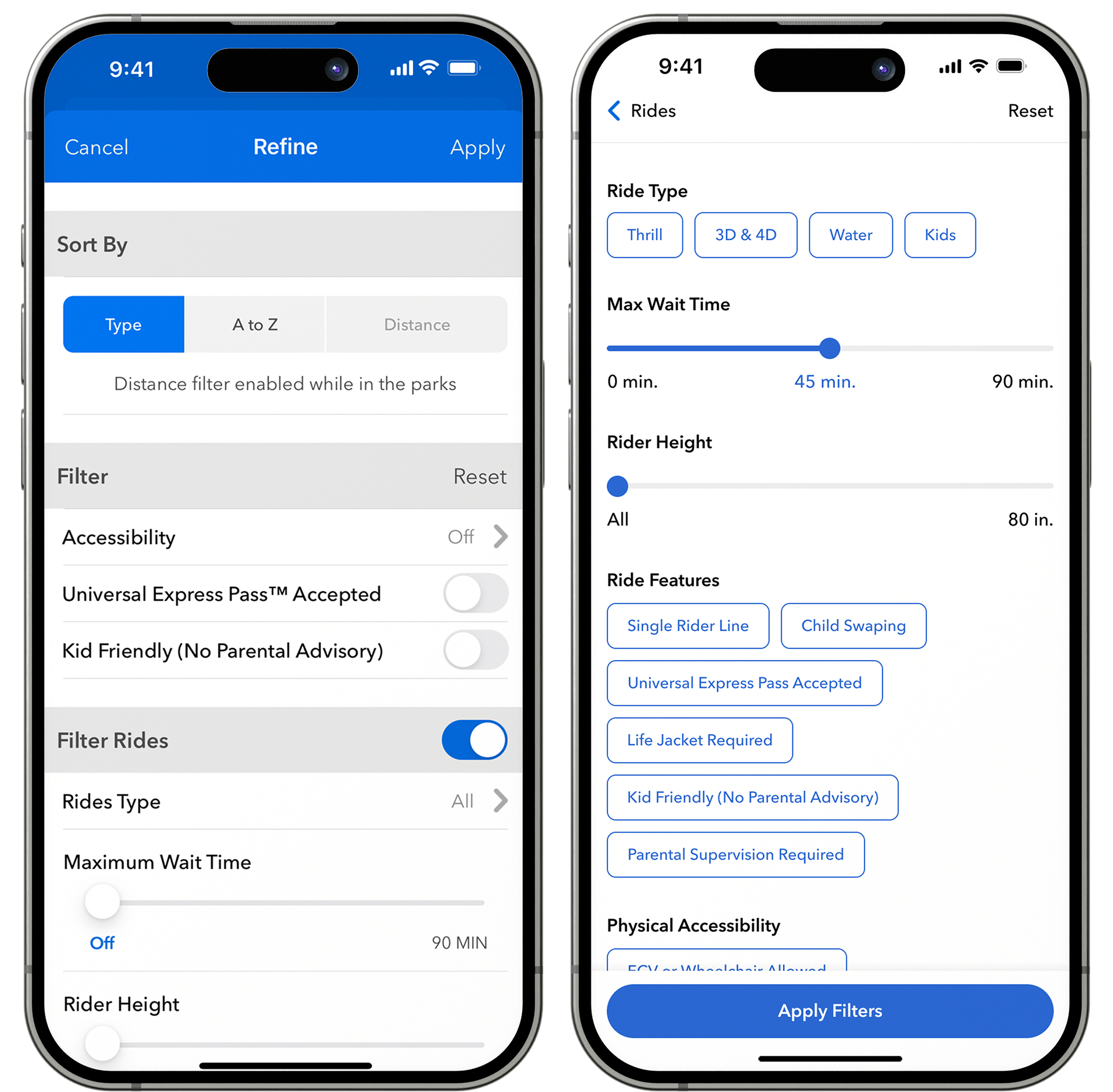
The previous filter experience was cluttered and confusing, with too many pages and controls that weren’t always relevant or appropriate. This complexity led to user frustration. In the new design, I simplified and streamlined the process to reduce visual noise. Since the updated map shows only one category at a time, we cut filter options by 75% compared to the previous version, which filtered rides, shows, shopping, and dining all at once. Controls were limited to two types: simple toggles for quick activation and sliders where needed. To improve clarity, I added more context to the page title to clearly indicate the category being filtered. A sticky "apply filters" button at the bottom of the screen offers an easy-to-reach touch target, helping guests move smoothly through the flow.
DESIGN WRAP UP & USER TESTING
A final round of user testing confirmed that the product was ready for launch.
After several weeks of iteration and peer reviews with the wider UX design team, the final designs were completed. As the design phase wrapped up, I continued user testing the prototype on UserZoom. Every participant scored 90 percent or higher on key tasks like locating or searching for an attraction, finding the list view, filtering the map, changing categories, and switching parks. With testing complete and designs finalized, it was time to document the work, hand it off to engineering, and watch the map come to life!
WHAT I LEARNED
It's important to partner with product and engineering on the delivery method.
The original delivery approach for this project followed a primarily waterfall model, with engineering input integrated throughout. However, due to the project’s scope and complexity, this quickly became overwhelming. Collaborating closely with the product owner and engineering team, we shifted to a phased rollout strategy that prioritized key features and functionalities for early release. This change allowed me to explore design variations more thoroughly and fine-tune the details, while enabling the engineering team to work more efficiently and deliver higher-quality results.
