iOS/ANDROID APP CASE STUDY
Walmart's Generative AI
Product Details Redesign
OVERVIEW
Walmart customers found the existing item detail experience frustrating. It was hard to navigate, overloaded with dense content, and did not clearly highlight the information needed to make a purchase decision.
Walmart's item detail page gets over 70 million views a day and plays a key role in helping customers make confident purchase decisions. However, feedback and research showed that shoppers often struggled to find item details, which are essential for evaluating and understanding a product. To solve this, we set out to redesign how those details are discovered and presented, while also exploring generative AI to enhance content and improve the overall experience.
ROLE & DETAILS
Senior Product Designer
Competitive Research, Prototyping, Testing, Leadership Presentations, Documentation
Team
1 Product Designer
1 Product Owner
2 Engineers
Design Timeline
September 2023 – March 2025
Tools
Figma
THE CHALLENGE
"How might we improve the item detail experience to make key information easier to find and understand, while using generative AI to surface the insights customers need to purchase with confidence?"
Mobile customers using the Walmart app often had a frustrating experience when searching for key product information. Cluttered layouts, shaped by competing internal teams, required excessive scrolling to reach essential details. Third-party sellers had full control over the item content, frequently leading to overwhelming, repetitive, and poorly structured information. Our goal was to redesign this section of the item page to make product details more discoverable, easier to navigate, and more user-friendly.
On load
First scroll
Second scroll
Third scroll
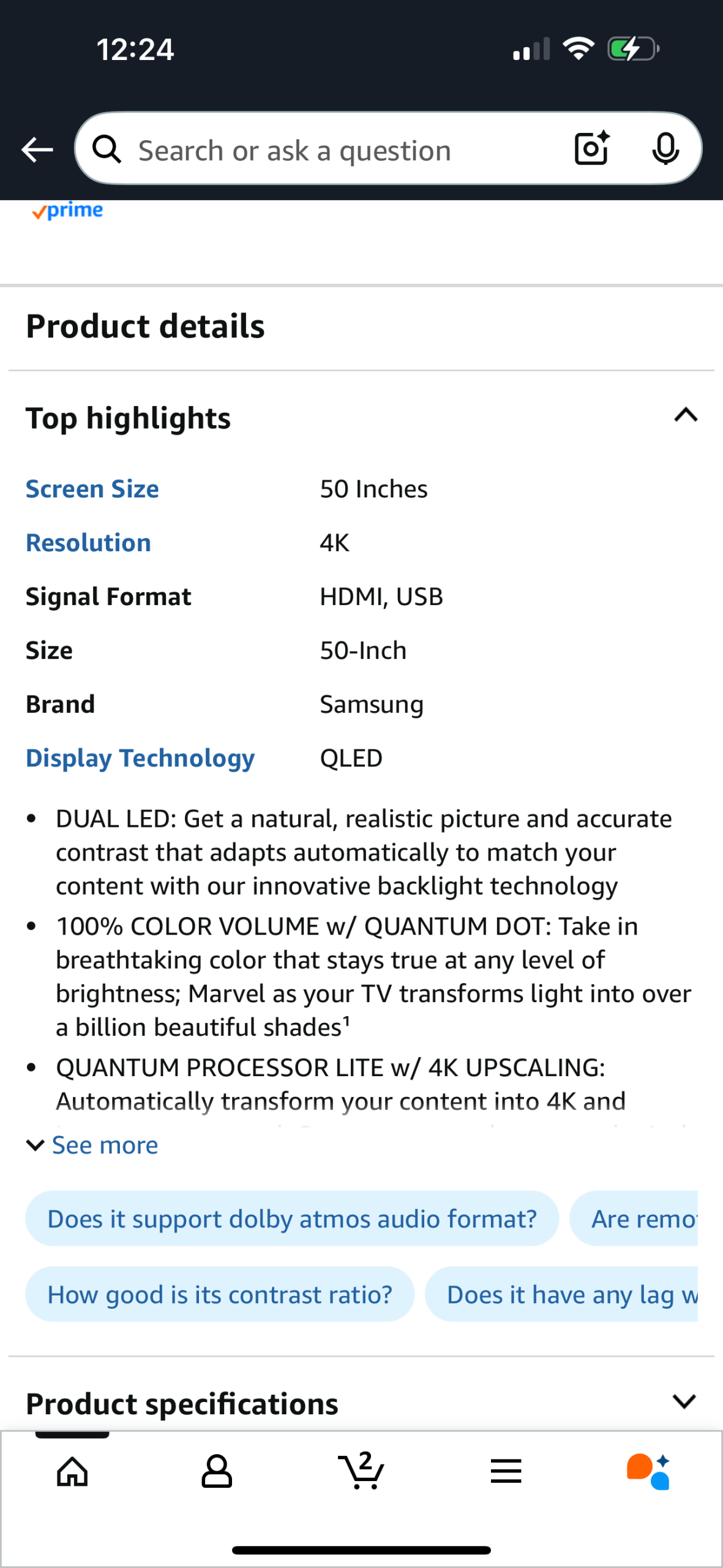
Amazon
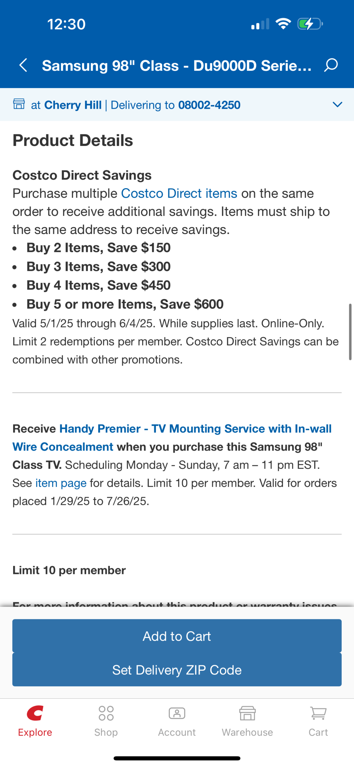
Costco
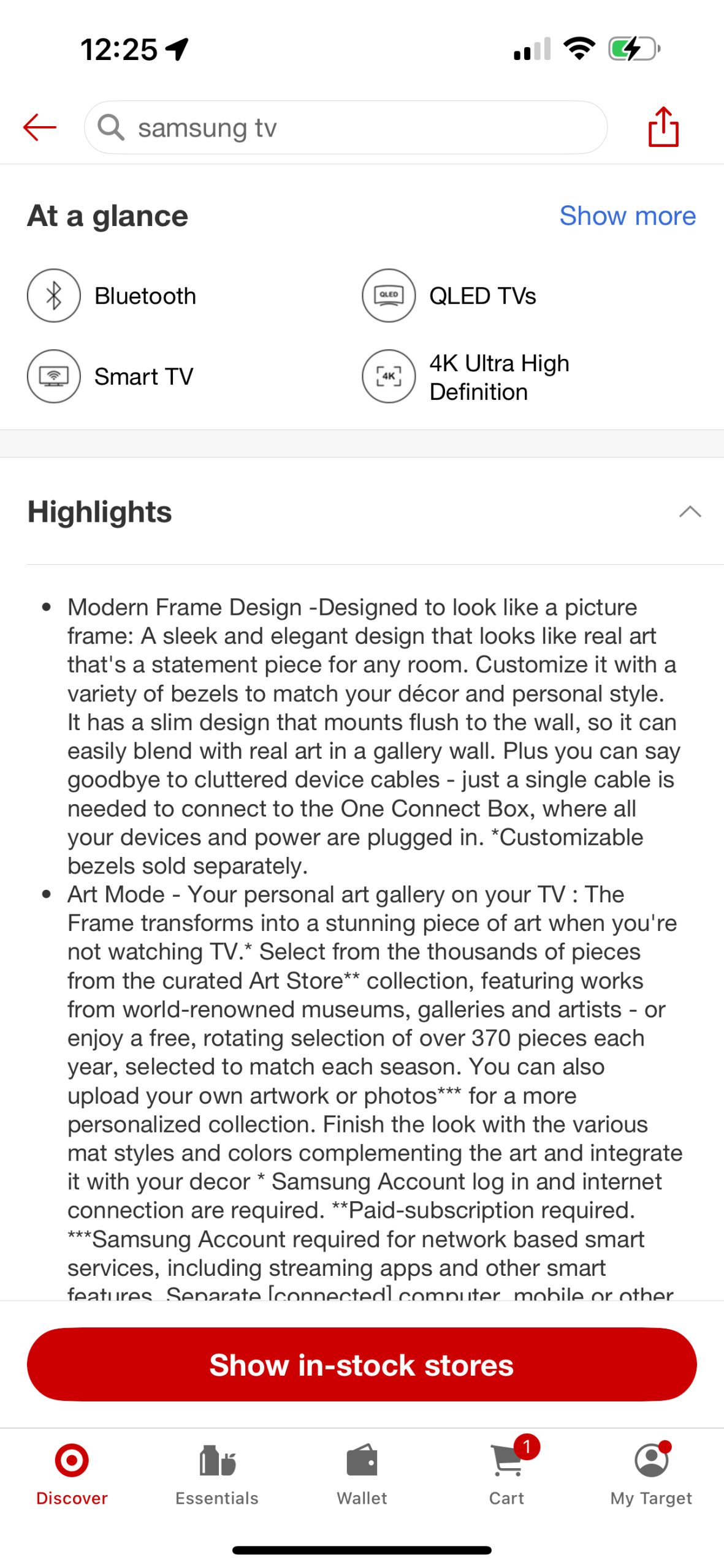
Target
Wayfair
Best Buy
Temu
COMPETITIVE RESEARCH
I was surprised to see how many competitors had underwhelming approaches.
• Amazon highlights a few key features at the top, followed by a short list of bullet points. The blue text appears to be a bug at first glance, but it's actually a set of clickable links. This feels unintuitive.
• Target starts with iconography but quickly overwhelms users with a dense block of text, making it difficult to scan or absorb.
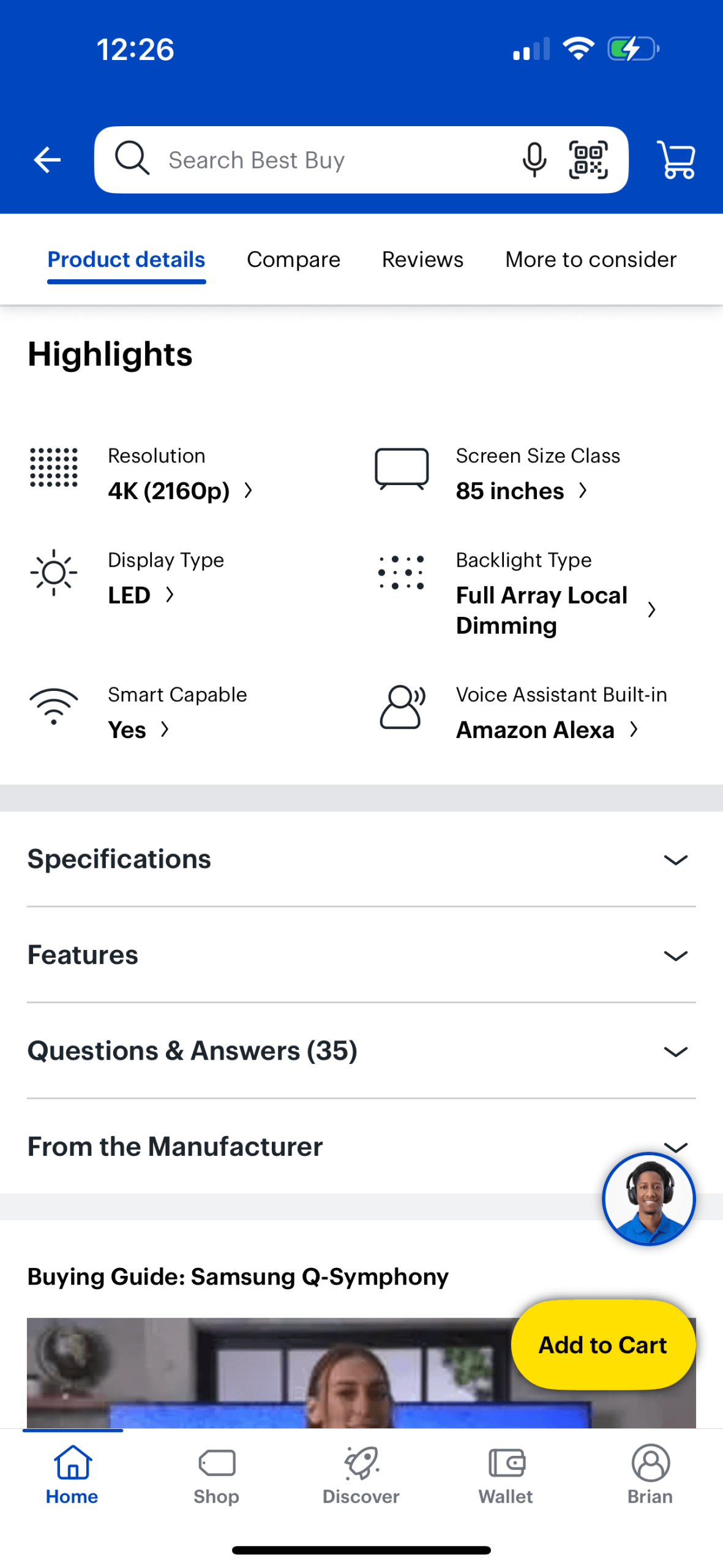
• Best Buy uses icons and clear arrows to indicate expandable content, which is helpful. However, most sections are collapsed by default, requiring users to manually click through to find details.
• Costco seems more focused on encouraging bulk purchases than on helping customers understand the specific product they're viewing.
• Wayfair highlights some key features with icons, but the layout lacks strong design or visual hierarchy, making it hard to quickly identify important information.
• Temu includes a rich media section, but it’s small, visually uninviting, and easy to overlook. It feels like an afterthought rather than a core part of the experience.
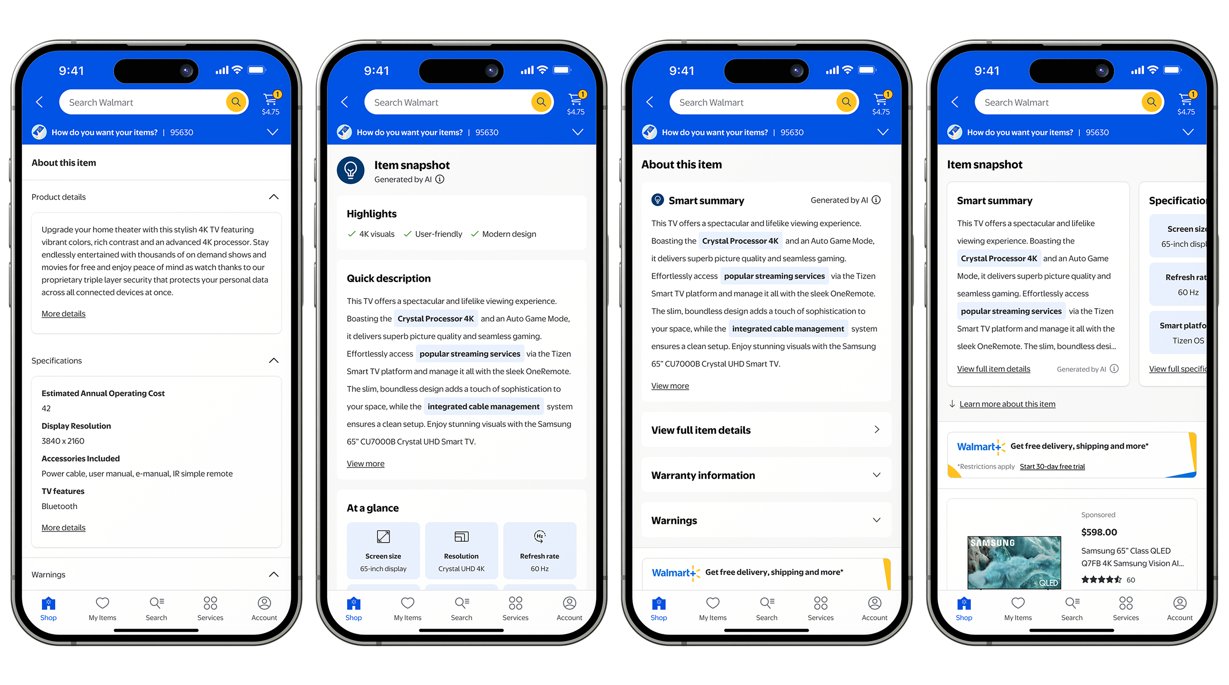
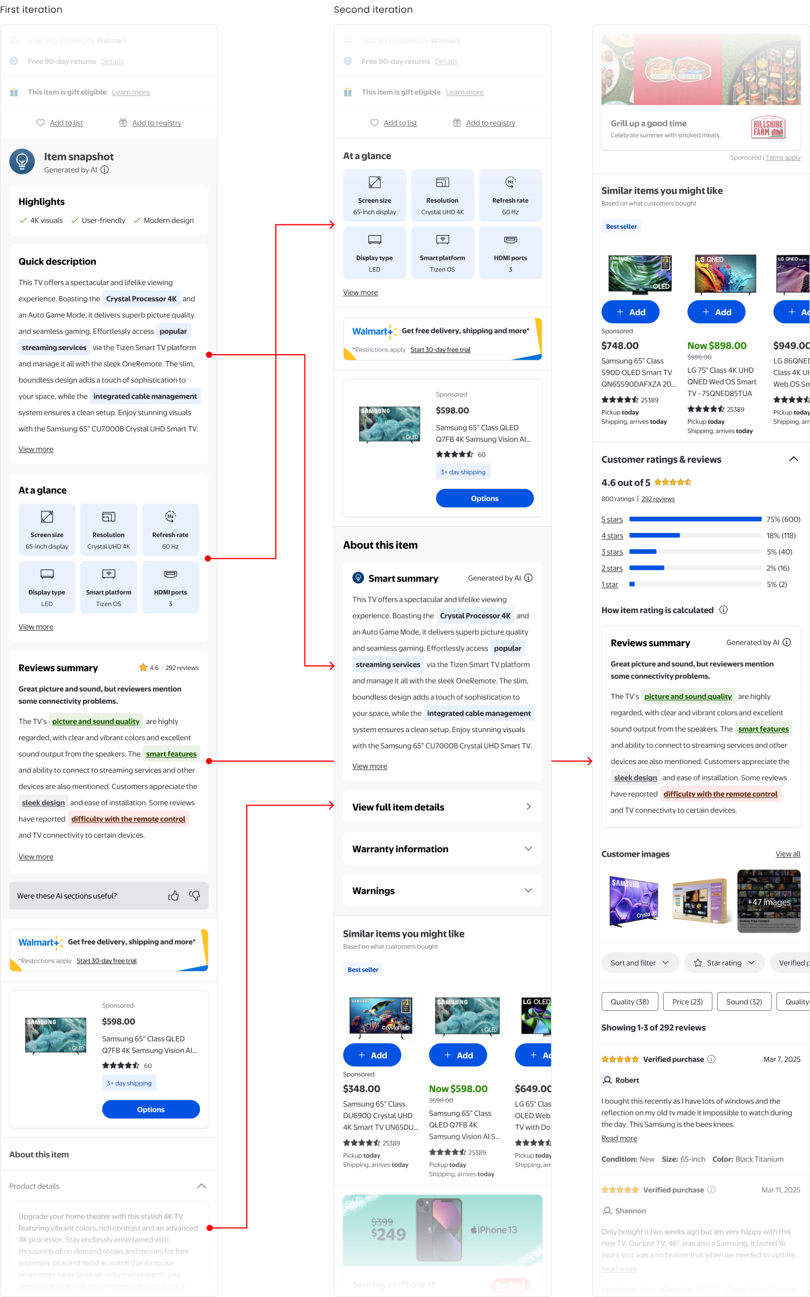
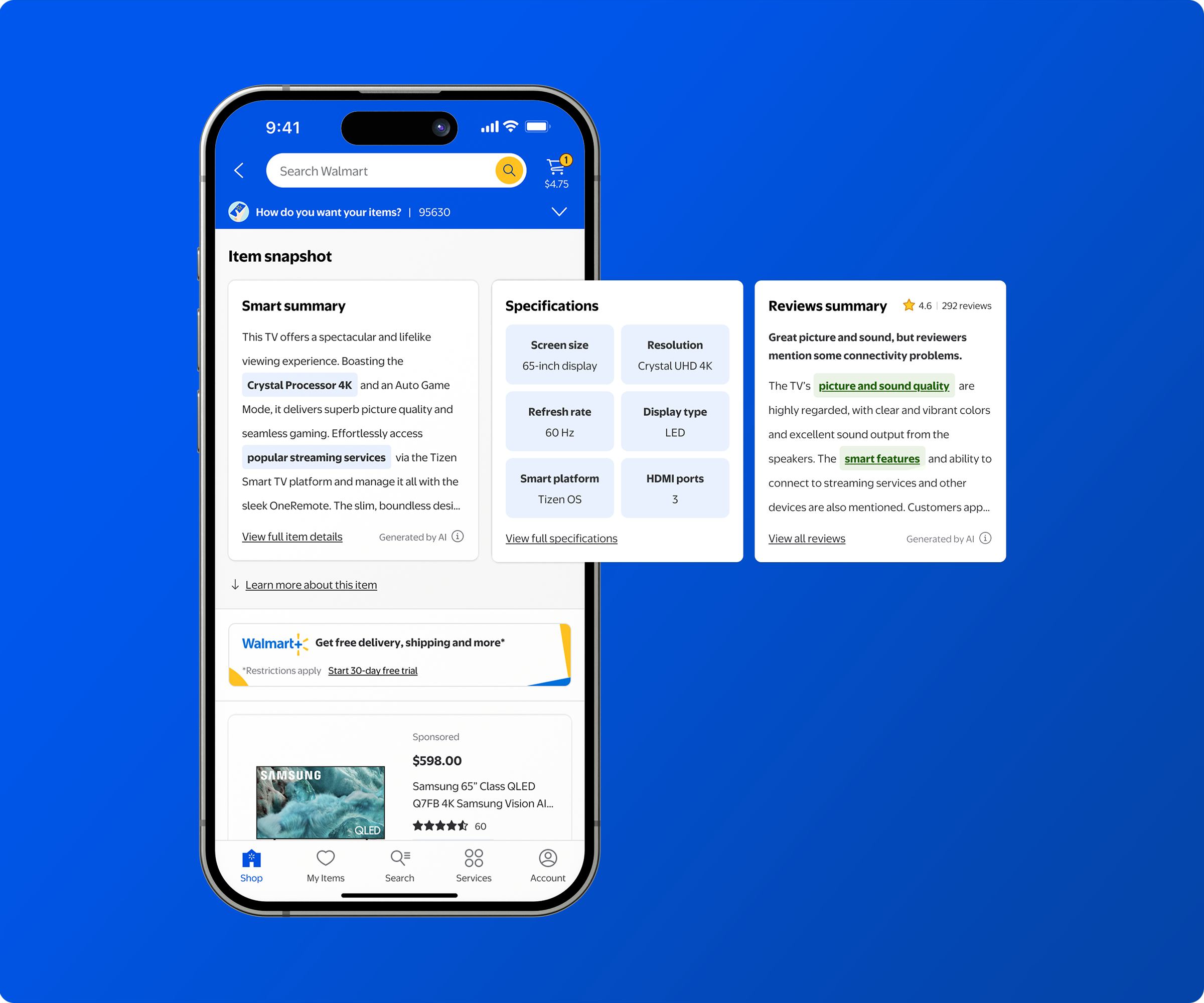
FIRST ITERATION
Using generative AI, we transformed item detail content into a seamless, all-in-one experience for customers.
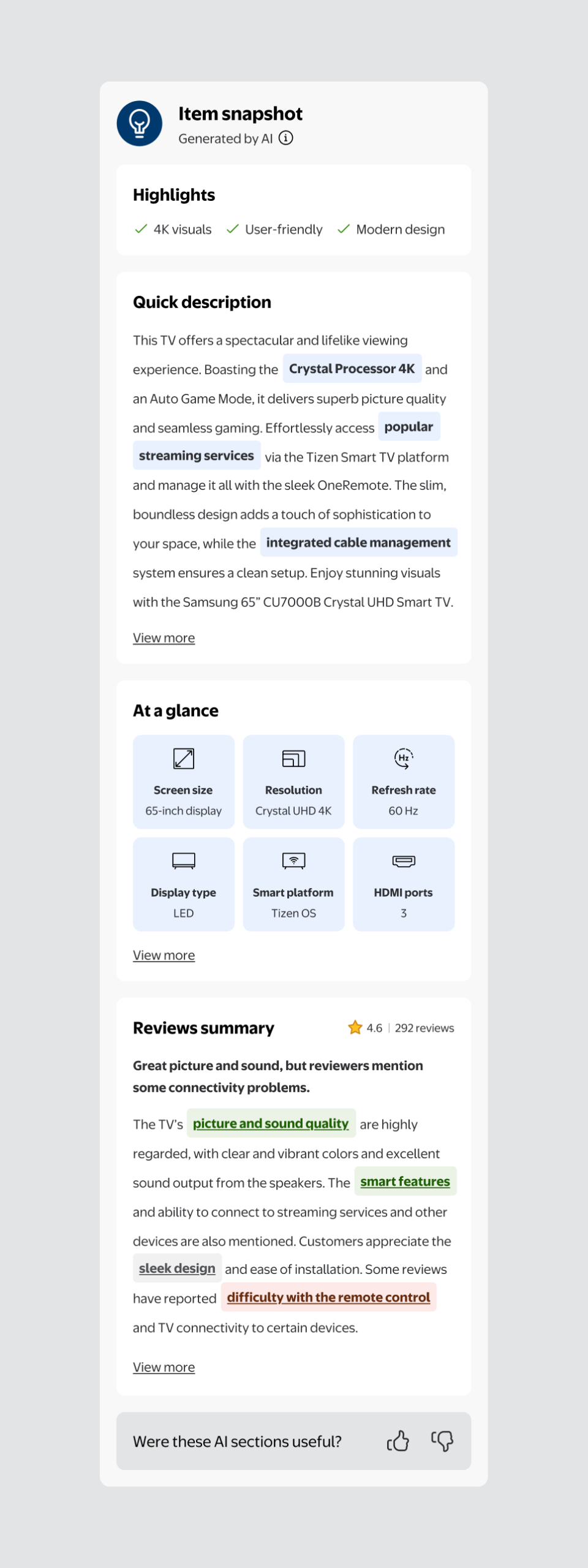
I structured the experience into four streamlined sections, each crafted to simplify, elevate, and enhance how customers engage with product information:
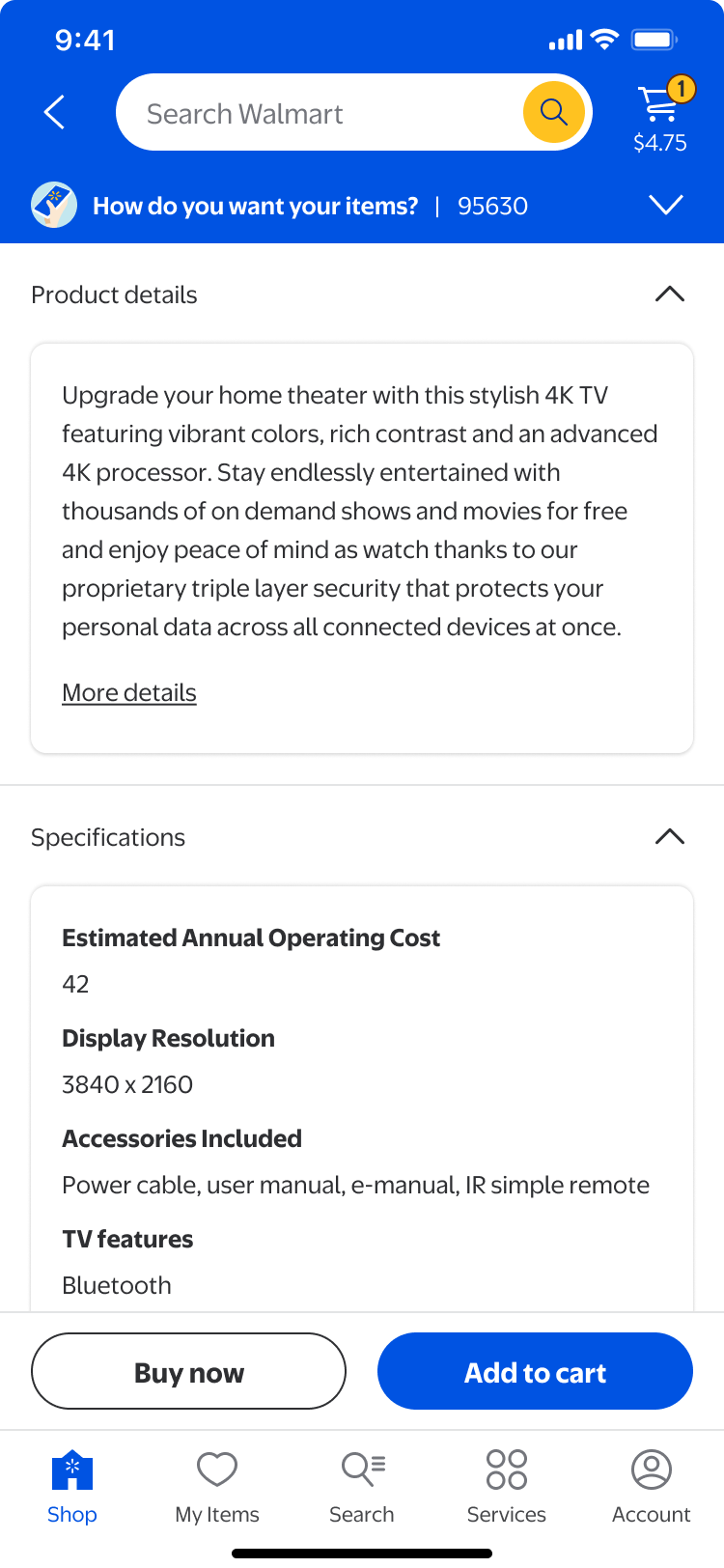
• Highlights: Featuring three key item benefits, each marked with a green checkmark to emphasize positive attributes.
• Quick description: A concise 400-character summary that distills lengthy, often overwhelming third-party details into an easy-to-read paragraph. Blue highlights draw attention to important terms, while a “View more” link opens a bottom sheet with the full third-party description.
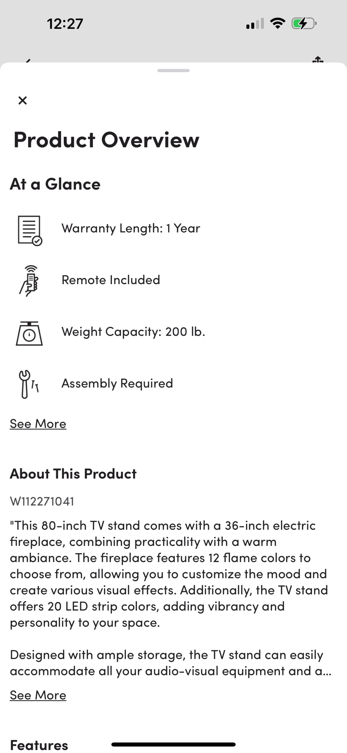
• At a glance: Showcasing six essential specifications paired with intuitive icons for quick visual comprehension. A “View more” link lets users explore the full specs list in a bottom sheet.
• Reviews summary: Condensing all customer reviews into a clear headline and summary paragraph. Color-coded highlights—green for positive, red for negative, and gray for neutral—allow quick sentiment scanning and direct access to relevant reviews.
I also included a brief feedback section at the end to help assess both the potential interest in this feature and the accuracy of the information provided. By leveraging generative AI in tandem with intentional visual design, I restructured complex, information-heavy content into clear, interactive modules that effectively direct user attention and support more confident, informed purchase decisions.
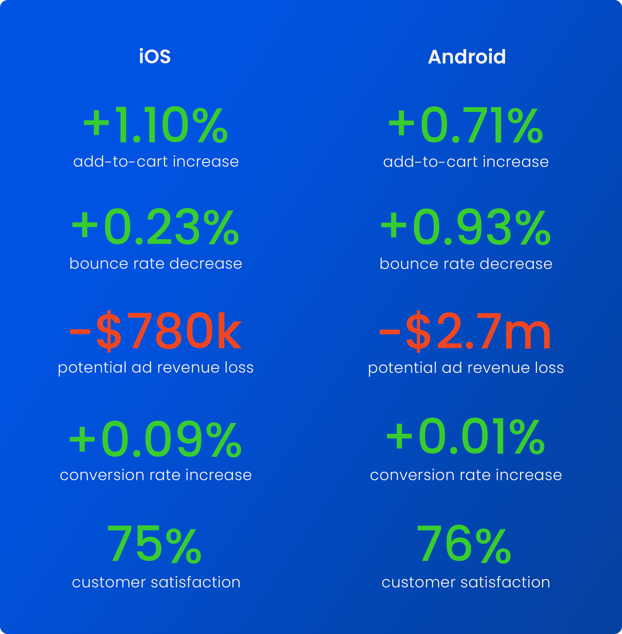
TESTING RESULTS
Testing the experience yielded interesting, exciting results.
Early testing showed promising results: iOS add-to-cart rates increased by 1.10%, while Android add-to-cart rates rose by 0.71%. Bounce rates also showed meaningful improvement, with a 0.23% decrease on iOS and a 0.93% decrease on Android. However, these wins came with a downside. Ad revenue from Walmart+ and sponsored placements declined, as those modules were pushed further down the page. If launched at scale, this shift could lead to annual losses of approximately $780,000 on iOS and $2.7 million on Android—a significant business risk. Despite strong customer satisfaction with the content (75% on iOS, 76% on Android), we chose to pause the rollout and focus on refining the experience to balance user value with business impact.
SECOND ITERATION
With learnings in hand, we decided to break up the experience—no hard feelings.
In the second iteration, we shifted from a single oversized module to a more flexible—and still moderately complex—design. Our goal was to regain lost ad revenue while keeping key product information prominently visible near the top of the page. To achieve this balance, we broke the content into smaller, manageable components and tested various placements to identify the most effective layout. We also eliminated and consolidated redundant item detail information further down the page to streamline the experience.
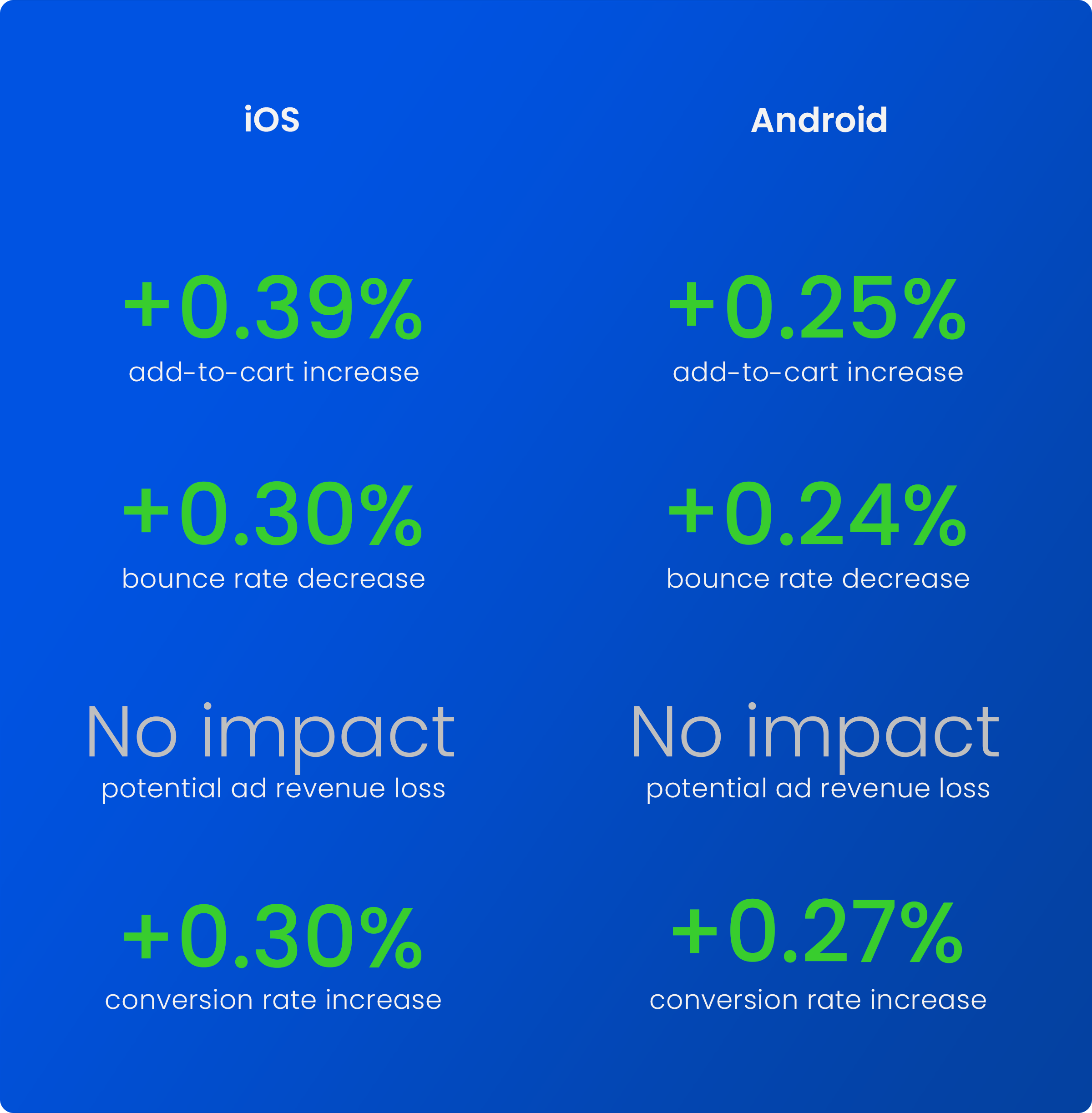
TESTING RESULTS
This round yielded strong results overall, yet we recognized there was still room for improvement.
The next round of testing continued to show strong performance across our native apps. Add-to-cart rates rose by 0.39% on iOS and increased by 0.25% on Android. Bounce rates also improved, dropping by 0.30% on iOS and decreasing by 0.24% on Android. Encouragingly, there was no reported impact on Walmart+ or sponsored ad revenue in this iteration, which was a welcome outcome for the business team. These positive results supported the decision to move forward with a full launch. However, we recognized the experience still needed refinement, as customers still had to hunt across multiple sections of the item page to find key decision-making information.
THIRD ITERATION
Since every scroll affects engagement, how can we balance showcasing key item information with preserving sponsored ad revenue, all without pushing out other important page elements?
Our original goal was to make key item information concise, easy to understand, and easily discoverable. However, testing revealed a new challenge: a significant drop in Walmart+ and sponsored ad revenue. Data showed that most customers scroll only a few times, highlighting the need to surface both essential item details and ads within the same viewport. In our third iteration, we tested two layouts that reduced vertical space compared to the original design, while still delivering critical decision-making content. As a result, Walmart+ and sponsored ads now appear 1,099 pixels higher on the page, and AI-generated content holds a more prominent position. Customers can also quickly access full third-party item details via a bottom sheet or a convenient scrollable jump link.
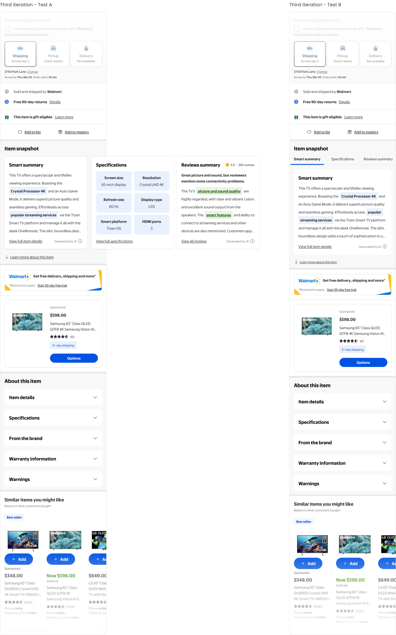
TESTING RESULTS & A FUTURE LAUNCH
This iteration is currently being tested on Walmart platforms. Check back for updates!
We believe this design strikes the right balance—presenting key item details clearly and accessibly without relegating other critical modules further down the page, while maintaining prime placement for Walmart+ and sponsored ads. You’ll be able to see this test live in the Walmart app soon, and we’ll continue sharing updates as testing progresses. The team is optimistic about securing approval to launch this new iteration in June 2025.